- BRAND POSITIONING - CORPORATE CULTURE - VERBAL IDENTITY - VISUAL IDENTITY -
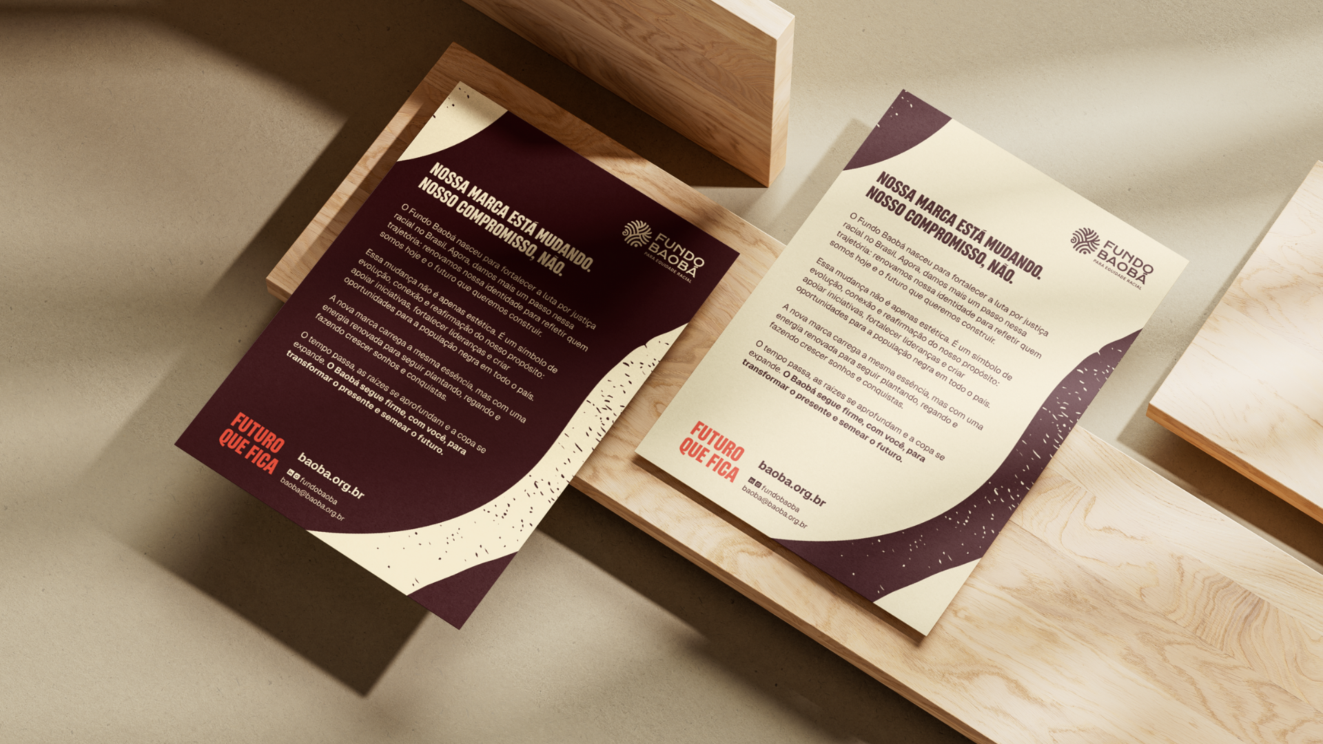
Fundo Baobá is the first and largest endowment fund in Brazil exclusively dedicated to promoting racial equity. Founded in 2011, the organization has matured, expanded its reach, and gained national relevance. However, its visual and verbal identity had not evolved at the same pace, falling short of expressing the full strength and solidity of its work. This gap made it clear that a complete rebranding was needed.
-
PT
Fundo Baobá é o primeiro e maior fundo patrimonial exclusivamente dedicado à promoção da equidade racial no Brasil. Criado em 2011, a organização amadureceu, expandiu seu alcance e conquistou relevância nacional. No entanto, sua identidade visual e verbal não acompanhava esse avanço, deixando de expressar toda a potência e solidez do seu trabalho. Foi nesse contexto que surgiu a necessidade de um rebranding completo.
Our Goal with the Project
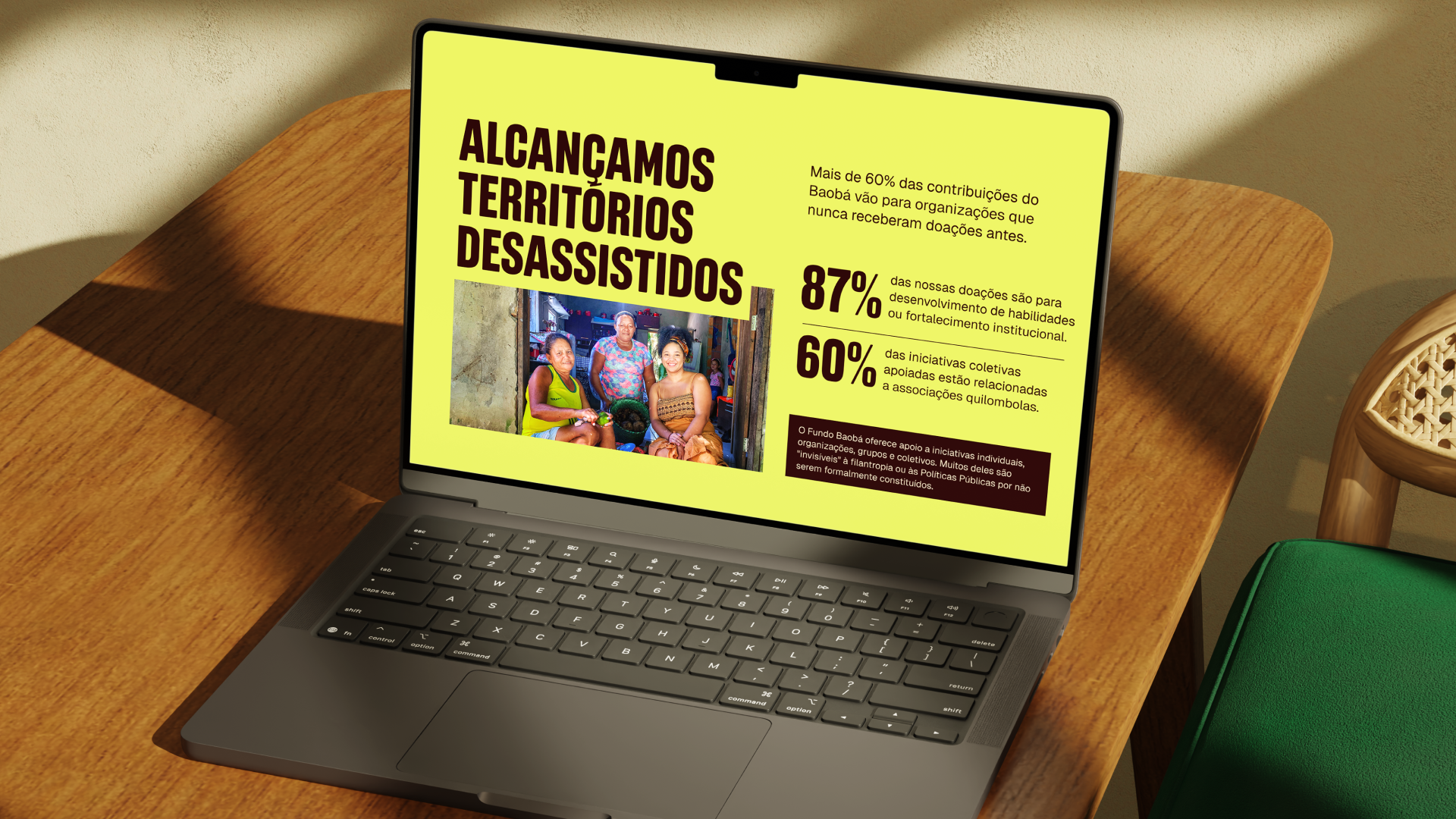
To reflect the scale and significance of Fundo Baobá within the Brazilian context, making the brand more appealing to a broad range of audiences –especially young Black individuals– and strengthening their engagement with open calls and grant opportunities. Additionally, the goal was to reinforce the organization’s internal culture, ensuring it authentically represents those who are part of it.
Challenge summary: How can we communicate the essence, trajectory, and impact of Fundo Baobá through a new brand positioning and tone of voice that reconnect with its roots without falling into stereotypes or oversimplified portrayals of Afro-Brazilian identity? How can we build a visual identity that conveys authority and maturity while honoring key figures and milestones in the organization’s history? And at the same time, how can we strengthen an internal culture that clearly represents the team and supports their daily engagement with the brand?
-
PT
Nosso objetivo com o projeto
Traduzir a grandeza e a relevância do Fundo Baobá no contexto brasileiro, tornando a marca mais atrativa para diferentes públicos, especialmente jovens negros e negras, e ampliando seu engajamento com chamadas e editais. Além disso, fortalecer a cultura interna da organização, garantindo que ela represente com autenticidade quem faz parte do Fundo.
Photos: Negros, Negócios e Alimentação
Insight and Strategy
Fundo Baobá believes in building a more just and inclusive future by strengthening initiatives led by Black individuals and organizations, and by supporting the historical fight for racial equity in Brazil. This core belief is reflected across every layer of the brand, from the slogan to the intentional use of emojis in its verbal communication.
A brand driven by purpose and rooted in heritage must express this clearly through its positioning. In Baobá’s case, this positioning carries the strength of ancestry and the lived history of the Black Brazilian population. It is shaped by a sense of time in which the past is honored through memory, the present is affirmed through action, and the future is built every day on a shared vision of equality.
-
PT
Insight e Estratégia
O Fundo Baobá acredita na construção de um futuro mais justo e inclusivo, por meio do fortalecimento de iniciativas lideradas por pessoas e organizações negras e do apoio à luta histórica por equidade racial no Brasil. Essa essência permeia todos os níveis da marca, desde o slogan até o uso intencional de emojis em sua comunicação verbal.
Uma marca que respira propósito e honra suas raízes com coragem precisa refletir isso com clareza em seu posicionamento. No caso do Baobá, esse posicionamento carrega a força da ancestralidade e a trajetória do povo negro brasileiro, costurado por uma noção de temporalidade em que o passado é preservado pela memória, o presente se afirma na ação, e o futuro é construído diariamente a partir de um ideal de igualdade que deve ser coletivo.
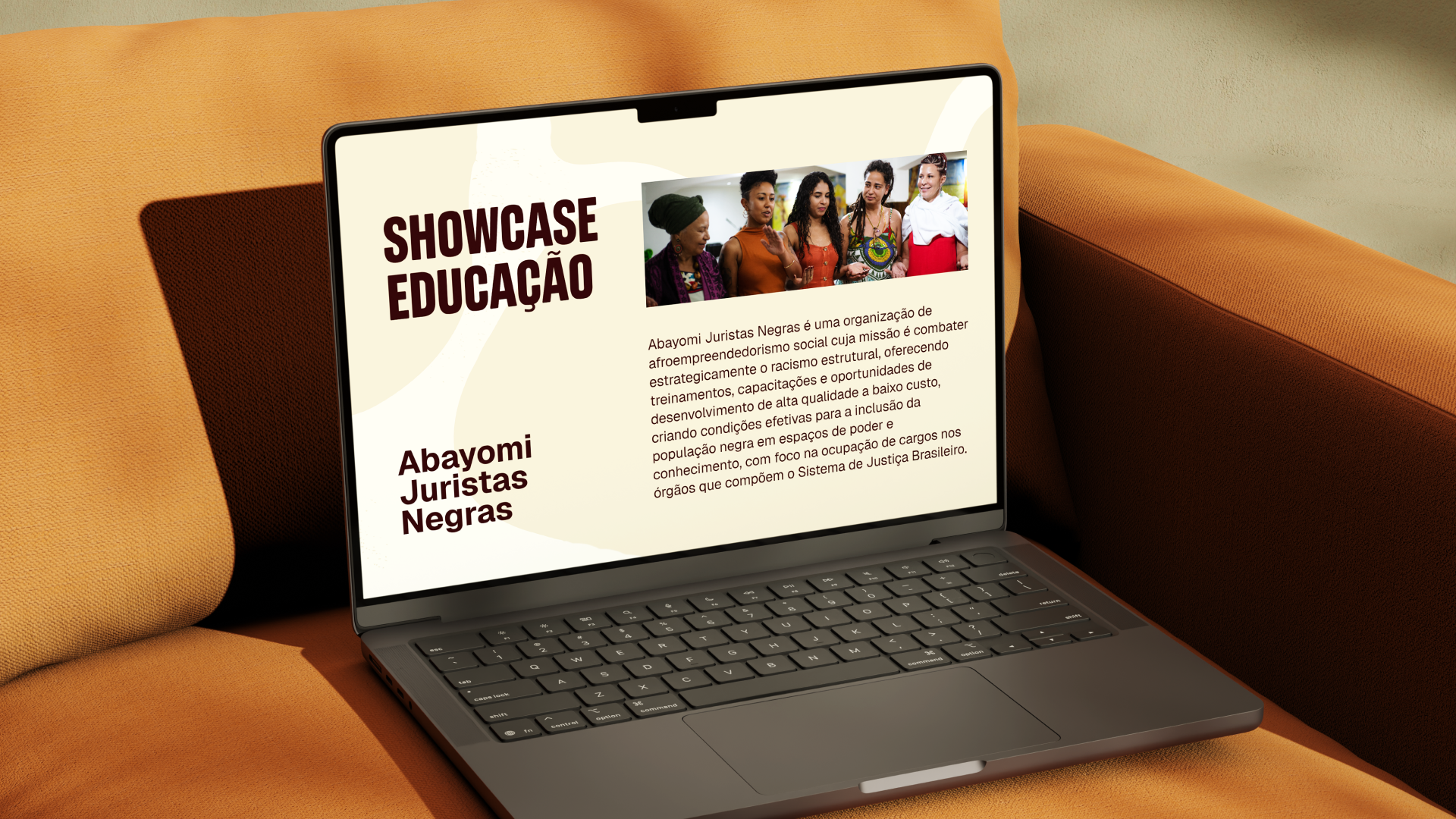
Photos: Educação e Identidades Negras
Verbal Identity
Fundo Baobá plays a mediating role by bringing complex and challenging topics to a broad range of audiences. It acts as a facilitator, blending the attentiveness and sensitivity of a storyteller with the clarity of an honest, grounded conversation. Its mission is to translate deep, philosophical reflections into accessible and meaningful language for as many people as possible.
This is why the brand’s tone of voice is welcoming, yet firm. Poetic, with purpose. Intellectually grounded, without being inaccessible. It carries the weight of a legacy, speaks from a place of resistance, invites dialogue, and approaches serious topics with the depth they demand, without creating distance.
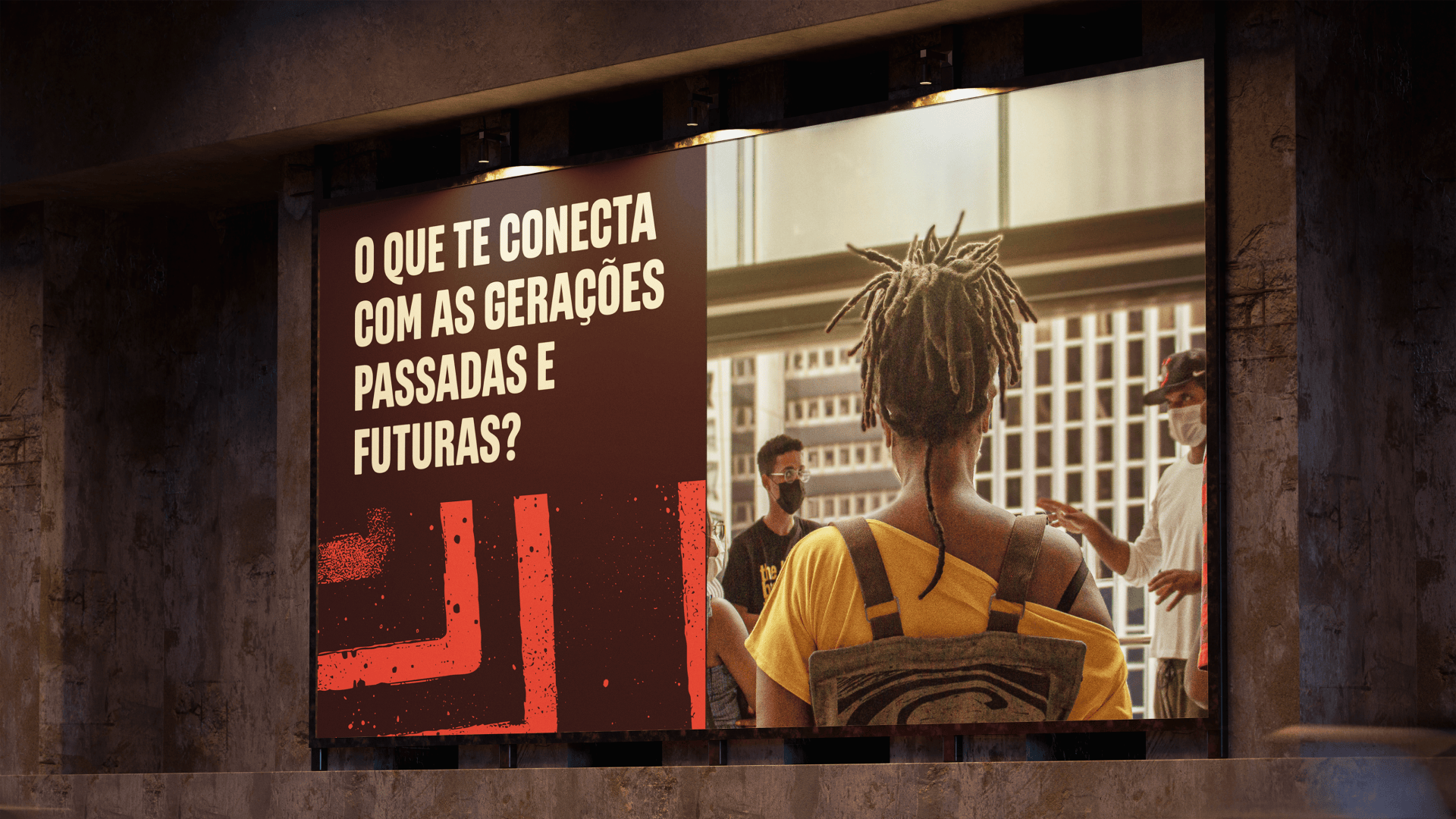
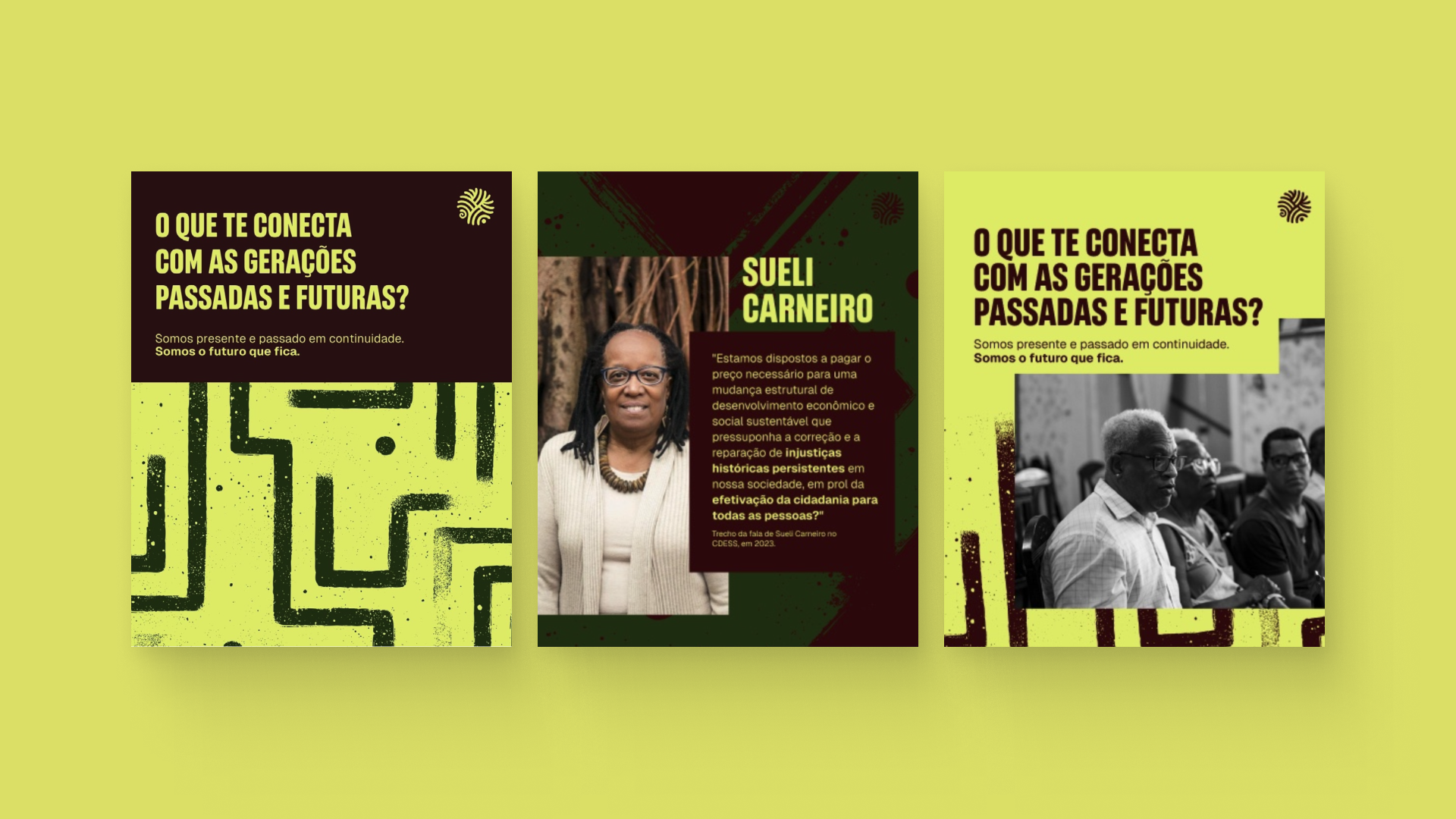
To connect more deeply with younger audiences, we developed a curated set of emojis to be used intentionally and symbolically as part of the brand’s verbal communication.
-
PT
Identidade Verbal
O Fundo Baobá cumpre um papel mediador ao trazer temas densos e complexos para diferentes camadas da sociedade. Atua como facilitador, combinando a escuta e a sensibilidade de um contador de histórias com a clareza de uma boa conversa. Sua missão é traduzir reflexões profundas e filosóficas de forma acessível e significativa para o maior número de pessoas.
Por isso, o tom de voz da marca é acolhedor, mas firme. Poético, com propósito. Intelectualmente sólido, sem ser inacessível. Ele carrega o peso de um legado, resiste, convoca para o diálogo e trata temas sérios com a profundidade que merecem, sem distanciamento.
Pensando especialmente em aproximar a marca de públicos mais jovens, desenvolvemos uma curadoria de emojis que integram a comunicação verbal de forma simbólica e intencional.
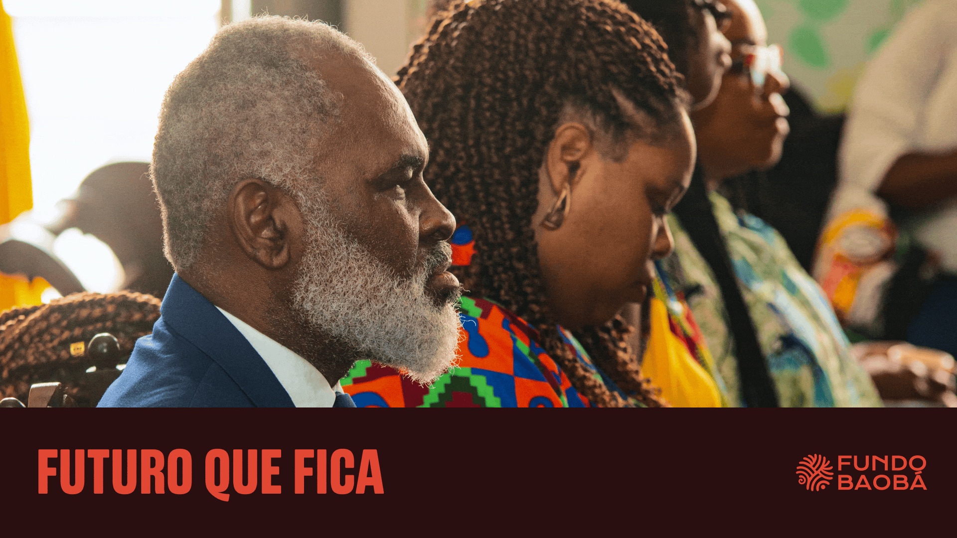
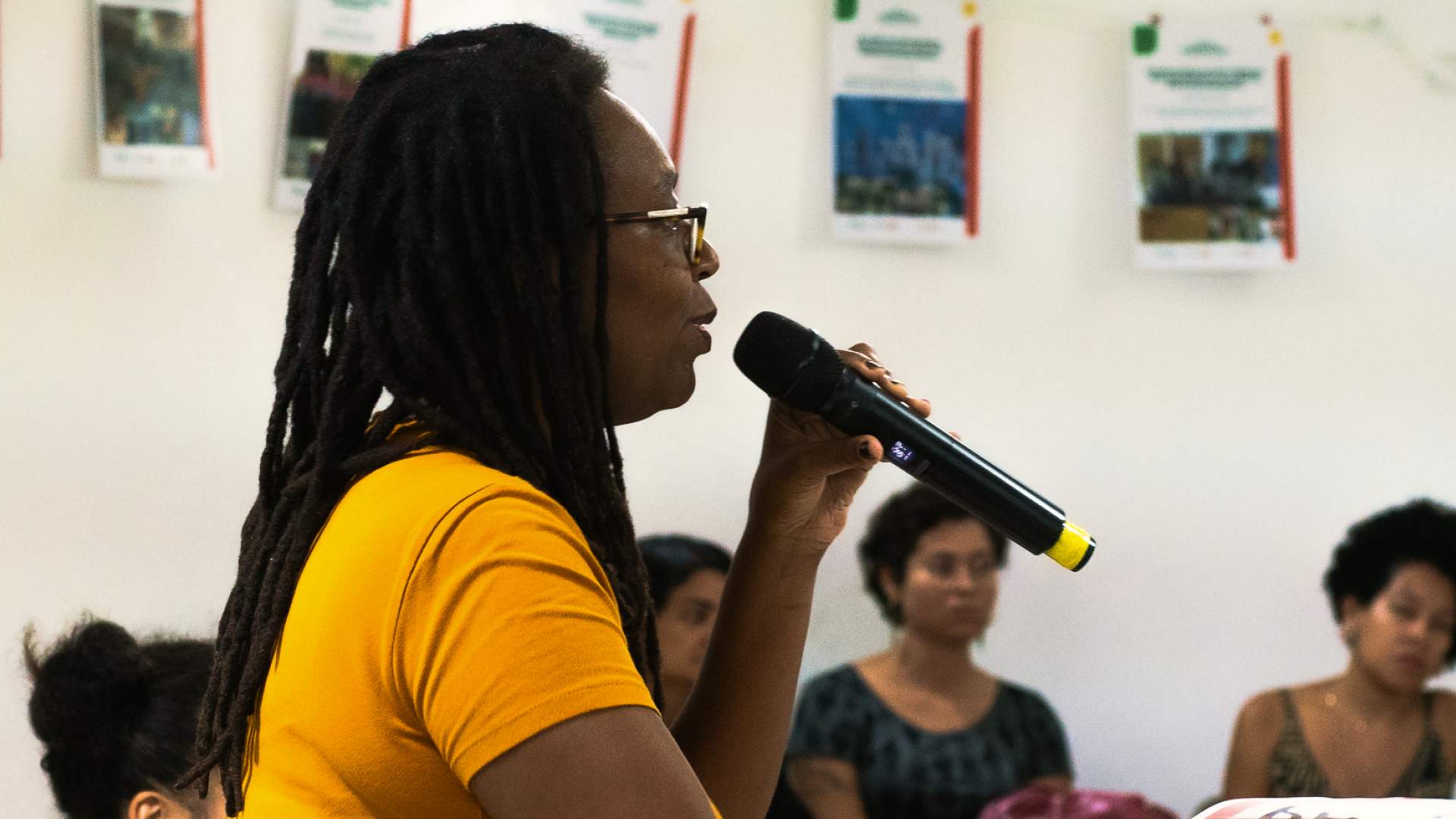
Photos: Shai Andrade | Visita Kellog - Salvador, 2025
Visual Identity
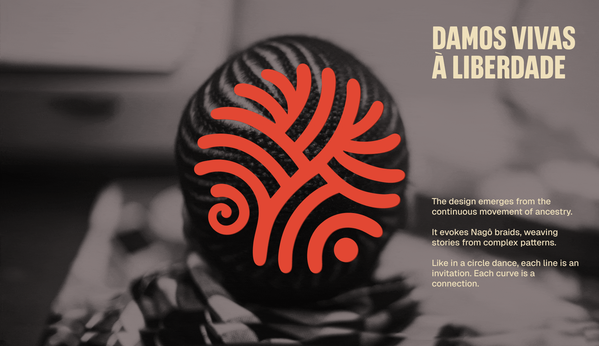
The graphic elements, color palette, and typography each carry distinct meanings rooted in the core pillars of the organization.
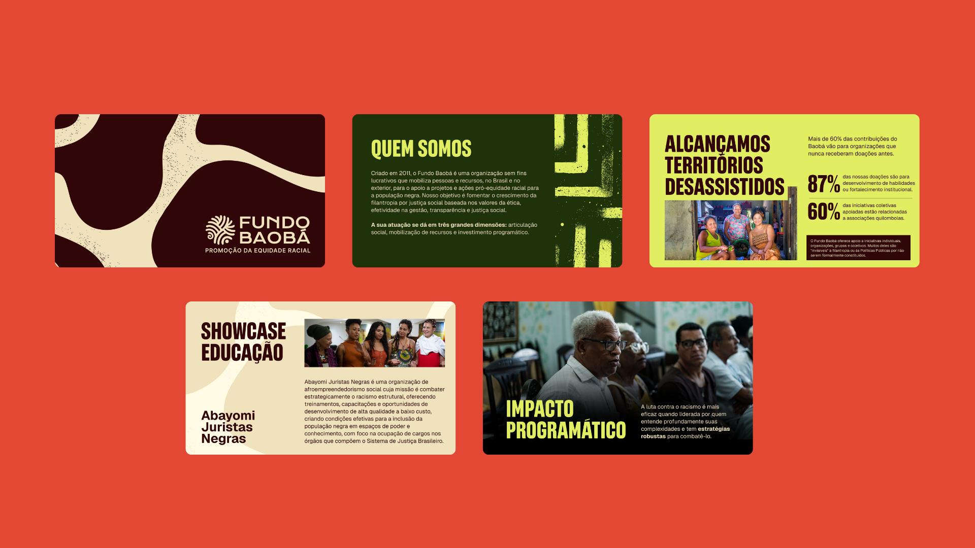
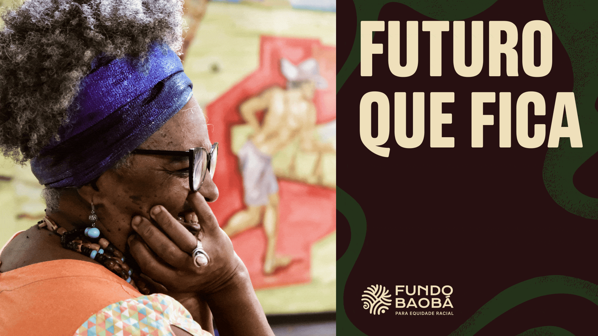
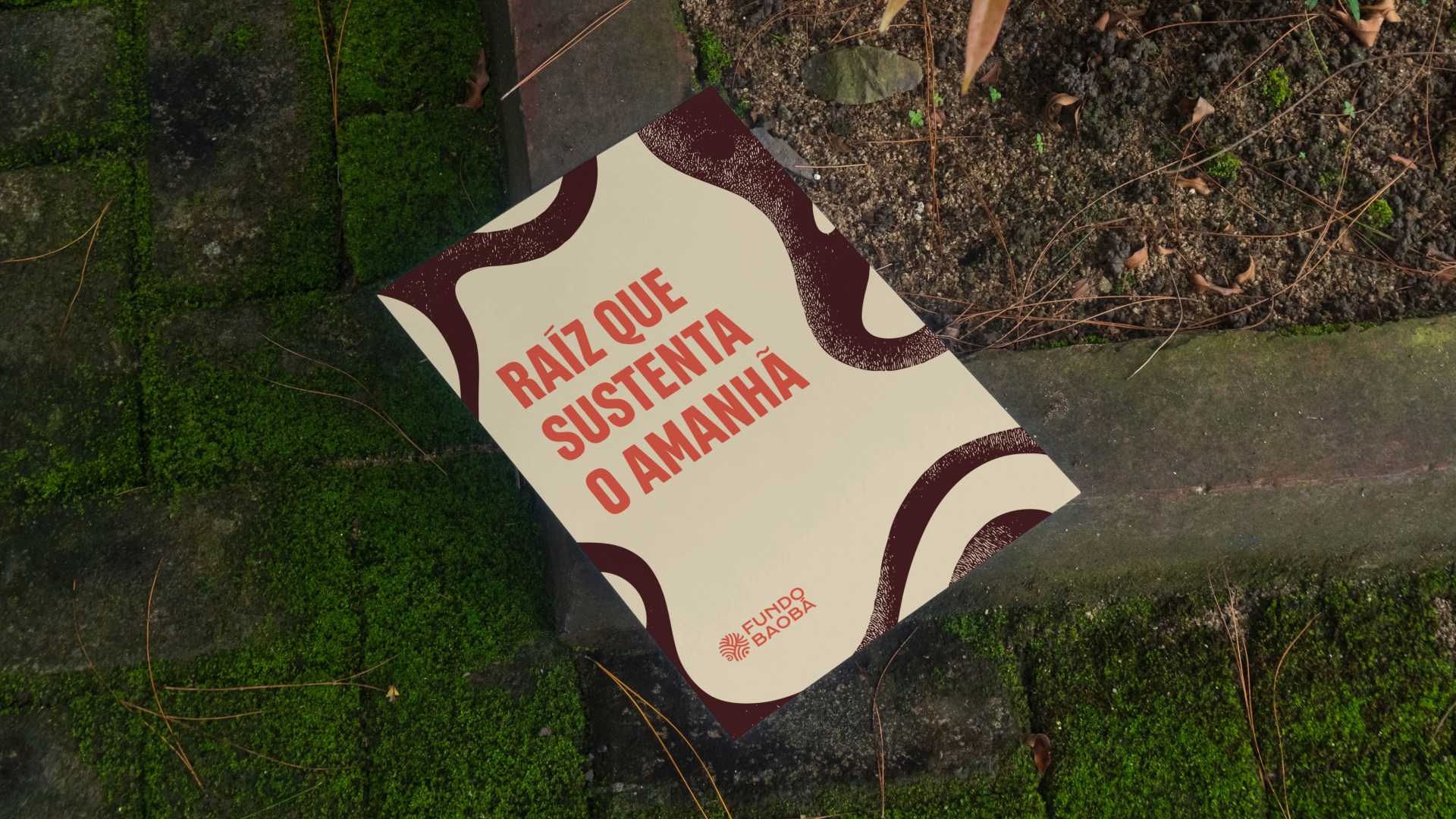
The baobab flower symbolizes Ancestral Futures, while a complex, textured graphic element, resembling a labyrinth, represents Memory. A third, more organic and flexible form stands for the Present.
Each color in the brand’s palette also holds significance and is directly linked to a specific area of action:
• Future Green and Earth Brown represent Education
• Earth Brown and Root Red represent Communication and Memory
• Moss Green and Future Green represent Economic Development
• Sand and Earth Brown represent Living with Dignity
• Earth Brown and Root Red represent Communication and Memory
• Moss Green and Future Green represent Economic Development
• Sand and Earth Brown represent Living with Dignity
This visual system was designed not only to guide communication but also to help organize and distinguish the calls for proposals issued by the organization.
-
PT
Identidade Visual
Os grafismos, cores e tipografia possuem significados únicos que nasceram dos pilares da instituição.
A flor da árvore Baobá representa o Futuro Ancestral. Um grafismo complexo e texturizado, como uma espécie de labirinto, representa a Memória. E uma estampa orgânica e flexível representa o Presente.
A paleta de cores também carrega significado e se conecta com cada pilar de atuação da marca: Verde Futuro e Marrom Solo representam a Educação; Marrom solo e Vermelho Raíz representam Comunicação e Memória; Verde Musgo e Verde Futuro representam o Desenvolvimento Econômico; Areia e Marrom Solo representam Viver com Dignidade.
Essa organização busca facilitar não só a comunicação, mas a organização dos editais lançados pela ONG.

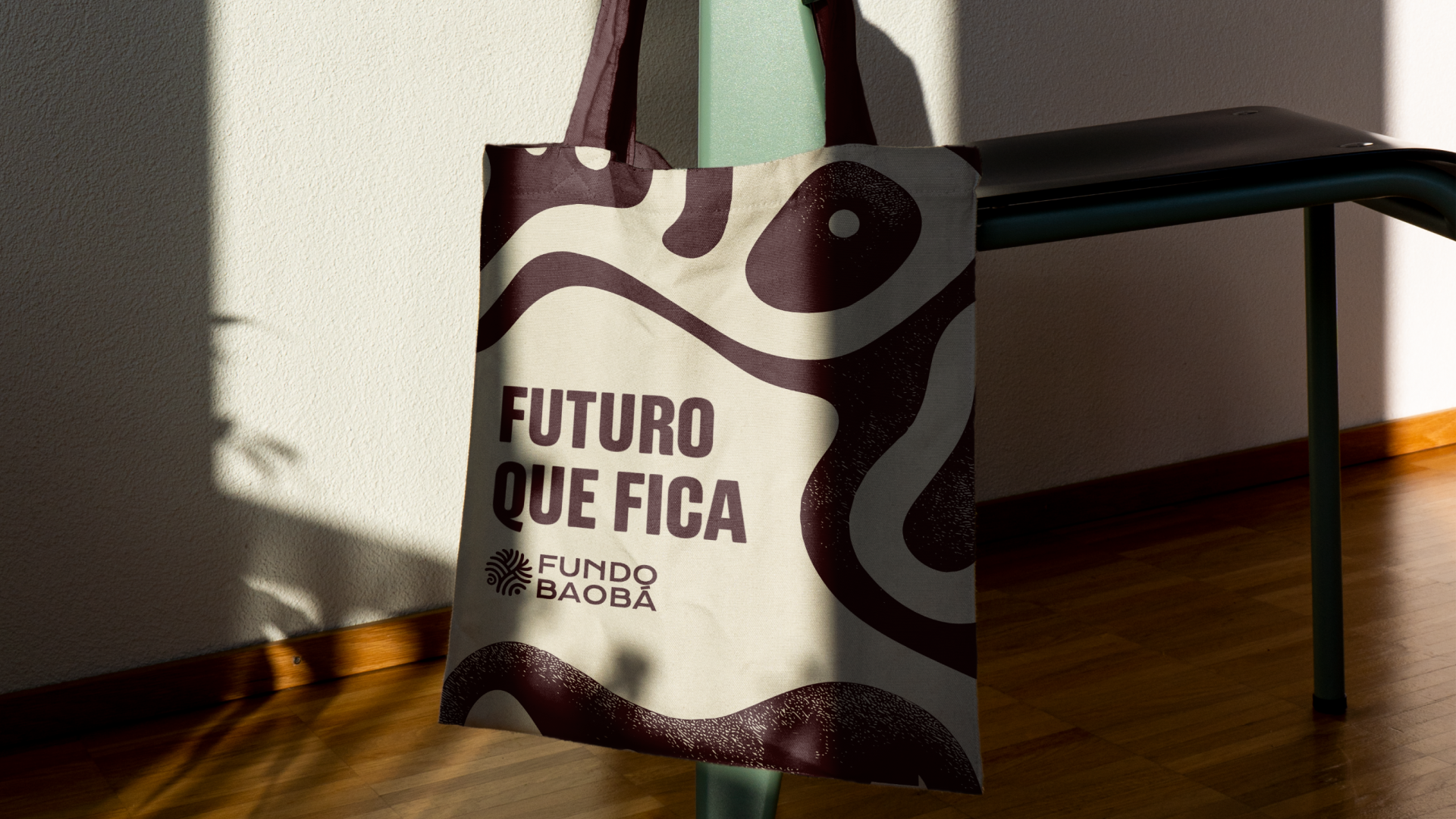
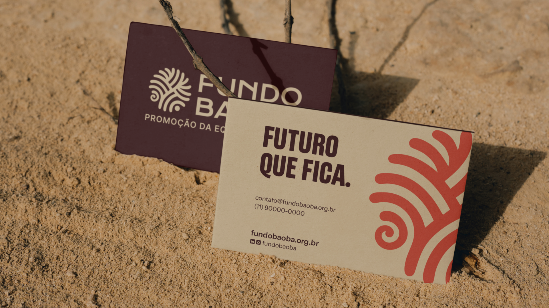
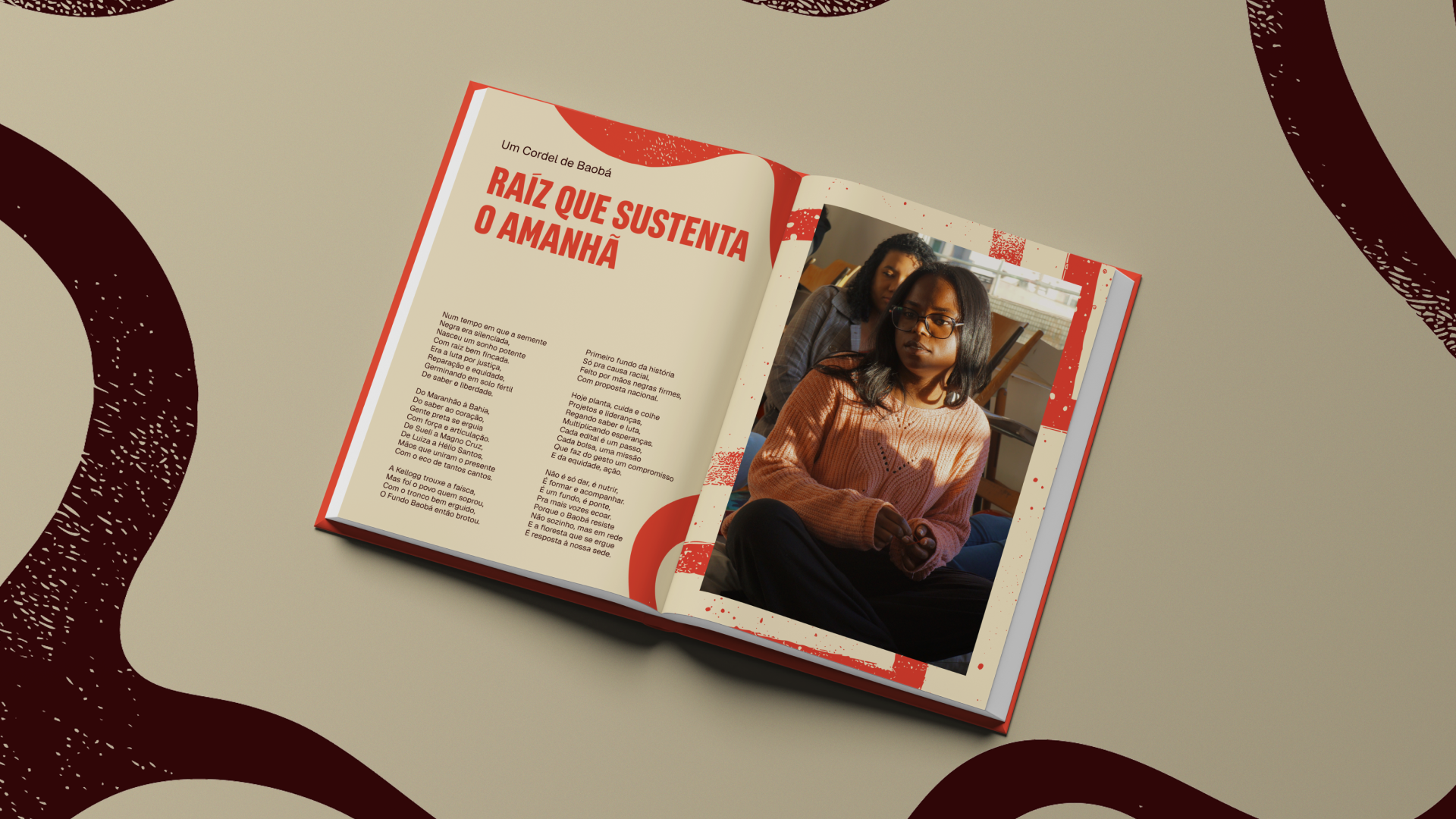
Photo: Já é 2021
Branding and visual identity: Motora
Creative Direction: Luize Araújo
Strategic Direction: Anna Carla Abreu
Strategy and writing: Anna Carla Abreu, Isabele Souza
Art Direction: Luize Araújo, Laís Fonseca
Designers: Laís Fonseca, Luize Araújo, Maria Stéfanni Carvalho
Case Design: Marcel Nagaro
Fundo Baobá Team: Janaína Barbosa, Xavier Amorim