- BRAND POSITIONING - VERBAL IDENTITY - VISUAL IDENTITY -
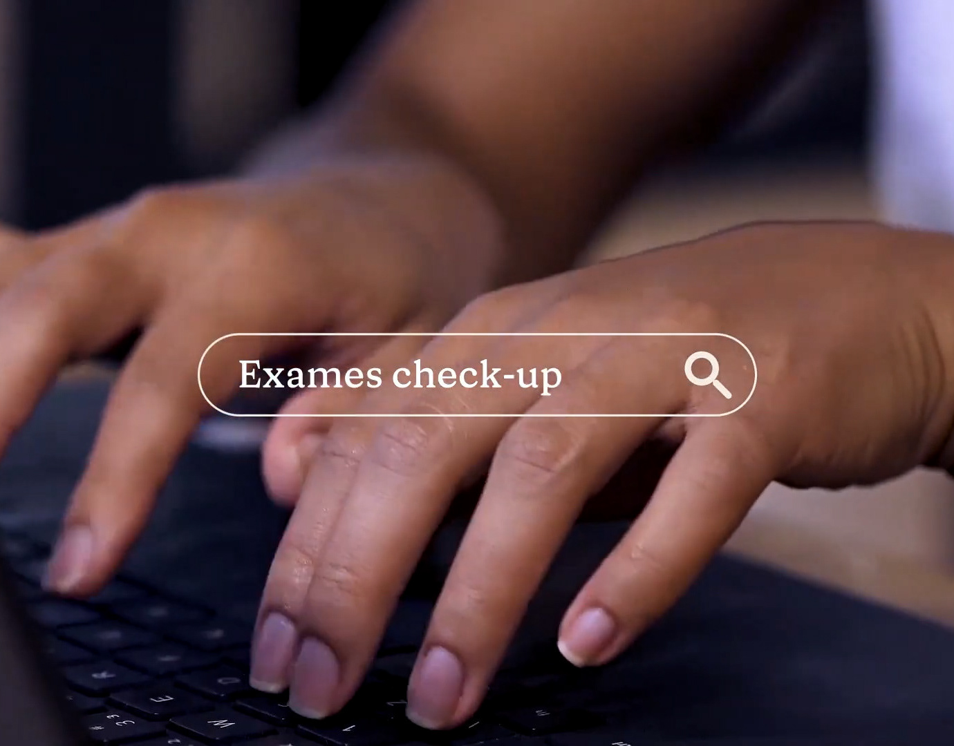
PantryPod emerged from the idea of filling a space that hadn’t yet been explored within the grab-and-go convenience market. The vending machine segment has long been associated with a lifestyle of people who don’t care about health, and with the stigma that it’s impossible to find truly healthy, high-quality products inside these machines.
PantryPod creates a meeting point between technology, health, and personality. It’s a brand designed to keep up with the rhythm of cities and the people who live in them. Here, the simple act of grabbing a snack gains new layers: transparency, care, and a good dose of humor.
-
PT
A PantryPod surgiu da ideia de alcançar um espaço ainda não ocupado no mercado de conveniência grab and go. O mercado de vending machines sempre foi muito associado ao lifestyle de pessoas que não se importam com a saúde e o estigma de que não se encontra produtos saudáveis e de alta qualidade dentro dessas máquinas.
Mais do que disponibilizar produtos, a PantryPod cria um ponto de encontro entre tecnologia, saúde e personalidade. É uma marca pensada para acompanhar o ritmo das cidades e das pessoas. Aqui, o simples ato de pegar um snack ganha novas camadas: transparência, cuidado e uma boa dose de humor.
Our Goal with the Project
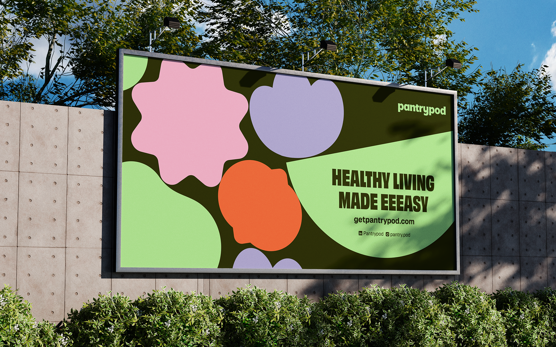
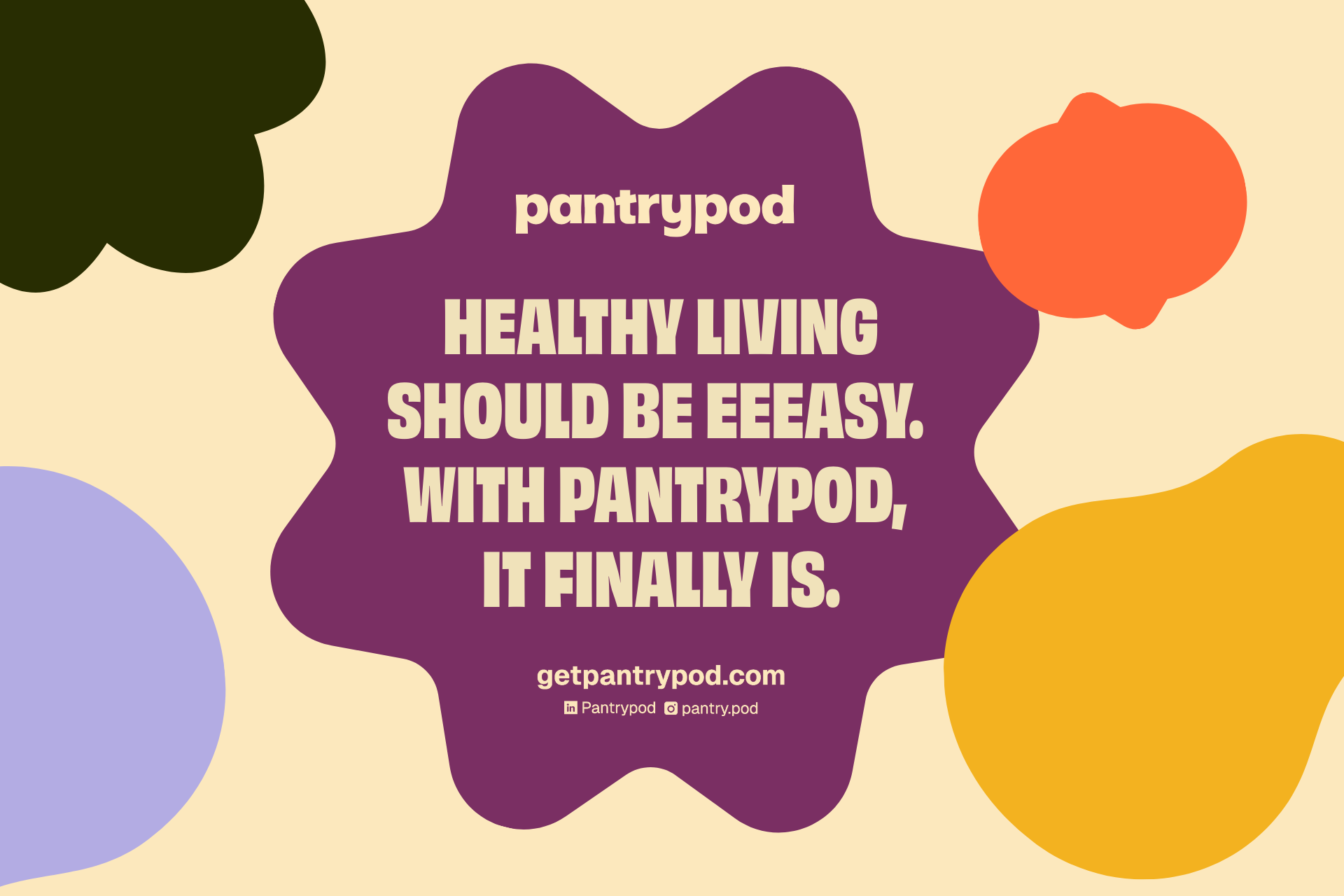
The project aims to communicate how PantryPod makes access to healthy food easier, faster, and more rewarding. The visual identity is designed to reflect the sense of youthfulness and innovation present in every detail of the experience, reinforcing the idea that eating well can be simple, practical, and enjoyable.
Challenge Summary: How can the idea of buying from vending machines feel cool? How can we express youthfulness, personality, and draw attention to a premium curation of healthy products? How can the simple act of choosing something healthy become practical, accessible, rewarding, and fun?
The challenge consists in reframing the world of vending machines and presenting it in a more contemporary and engaging way. Through verbal, visual, and strategic decisions, the project communicates freshness, authenticity, and a carefully curated selection of healthy products, showcasing how convenience, quality, and personality can coexist.
-
PT
Nosso objetivo com o projeto
Estruturar uma marca que expressa com clareza o papel da PantryPod no cotidiano das pessoas, facilitando o acesso à comida saudável e tornando essa escolha fácil, rápida e recompensadora. A identidade foi concebida para comunicar a jovialidade e a inovação presentes em cada detalhe da experiência, reforçando que comer saudável pode ser simples, prático e divertido.
Resumo do Desafio: Como tornar a ideia de consumir produtos de vending machines algo descolado? Como comunicar jovialidade, personalidade e chamar atenção para uma curadoria premium de produtos saudáveis? Como transformar o ato de comer saudável em algo prático, acessível, recompensador e divertido?
O maior desafio do projeto era em ressignificar o universo das vending machines e apresentá-lo de forma mais contemporânea, confiável e interessante. Por meio de decisões estratégicas, construimos uma marca que expressa frescor e autenticidade, provando que conveniência, qualidade e personalidade podem coexistir.
Insight and Strategy
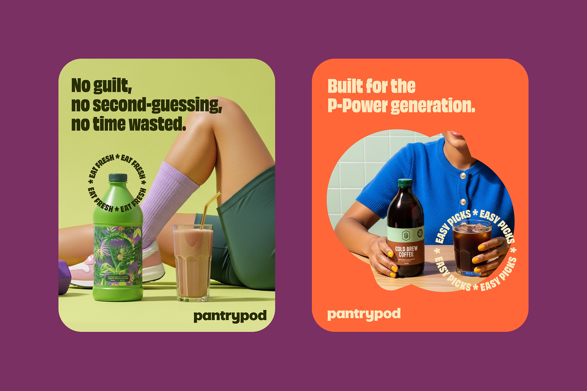
For PantryPod, living a healthy lifestyle shouldn’t be boring or feel like an obligation. Our strategy went beyond building a brand that proves healthy eating can be cool. We also set out to create a community that shares these same values. That’s how P-Power was born, a group of people who, even in the rush, refuse to compromise on their well-being. This community is vibrant and full of energy, just like PantryPod itself.
In addition, the brand's positioning was supported by a set of essential pillars: wellness always within reach (wellness on the go), an active and realistic lifestyle (movement that makes sense), truly careful product selection (top-shelf curation), a light and welcoming way of communicating (care and a bit of laughter), and the smart use of technology to enhance the entire experience (innovation with a purpose). All of this ensures that making good choices feels simple, intuitive, and aligned with the way life really is.
-
PT
Insight e Estratégia
Para a PantryPod, viver de forma saudável não deve ser algo entediante ou obrigatório. A estratégia foi além de construir uma marca capaz de mostrar que comer saudável pode, sim, ser cool. O objetivo também foi formar uma comunidade alinhada a esses valores. Assim nasceu a P-Power, composta por pessoas que não abrem mão do bem-estar. Essa comunidade é vibrante e cheia de energia, assim como a própria PantryPod.
Além disso, o posicionamento estratégico se sustenta por pilares essenciais: o bem-estar sempre à mão (wellness on the go), um estilo de vida ativo e possível (movement that makes sense), uma curadoria de produtos realmente cuidadosa (top-shelf curation), uma comunicação leve e acolhedora (care and a bit of laughter) e o uso inteligente de tecnologia para melhorar toda a experiência (innovation with a purpose). Tudo isso para que escolher bem seja simples, intuitivo e compatível com o ritmo real da vida urbana.
Verbal Identity
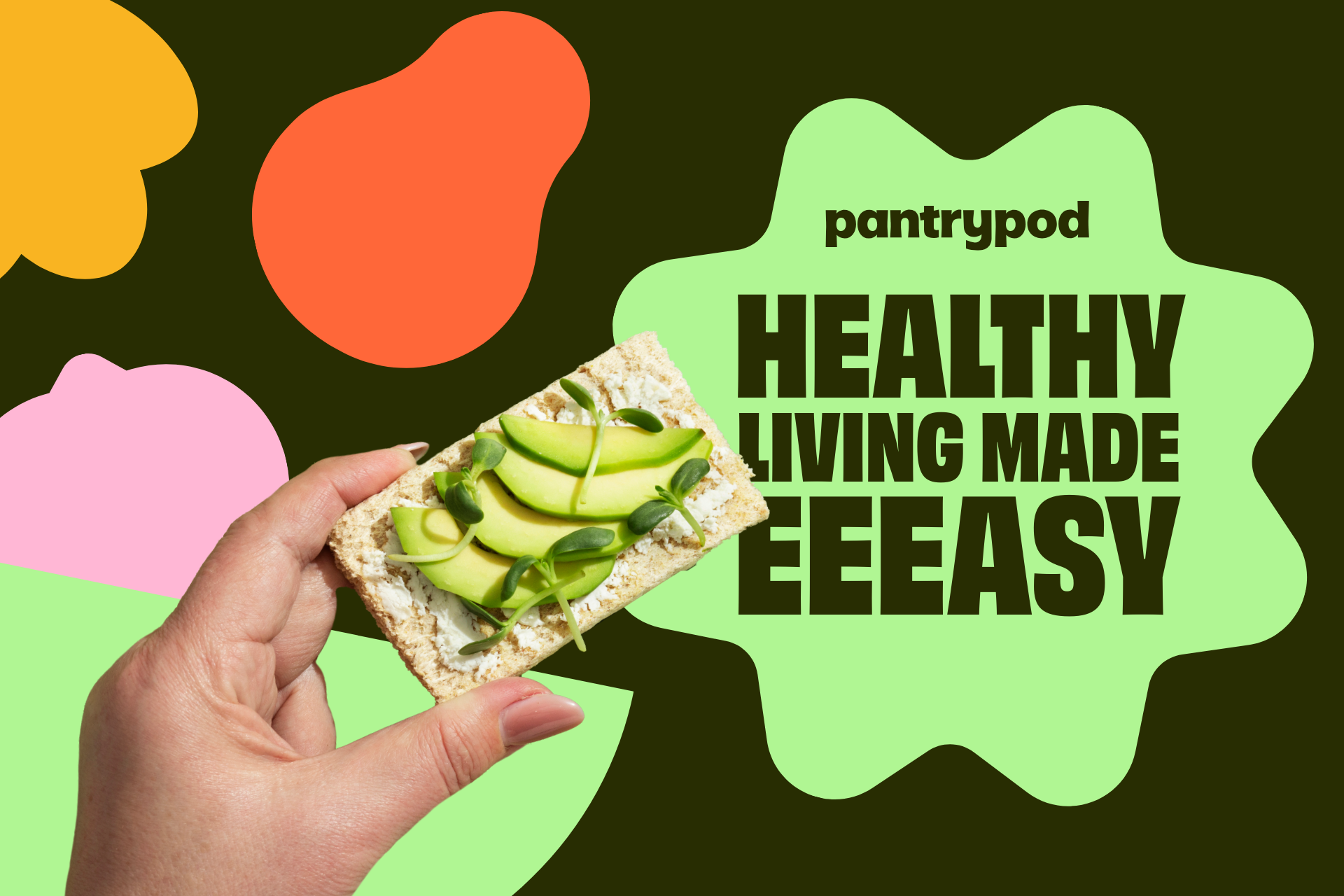
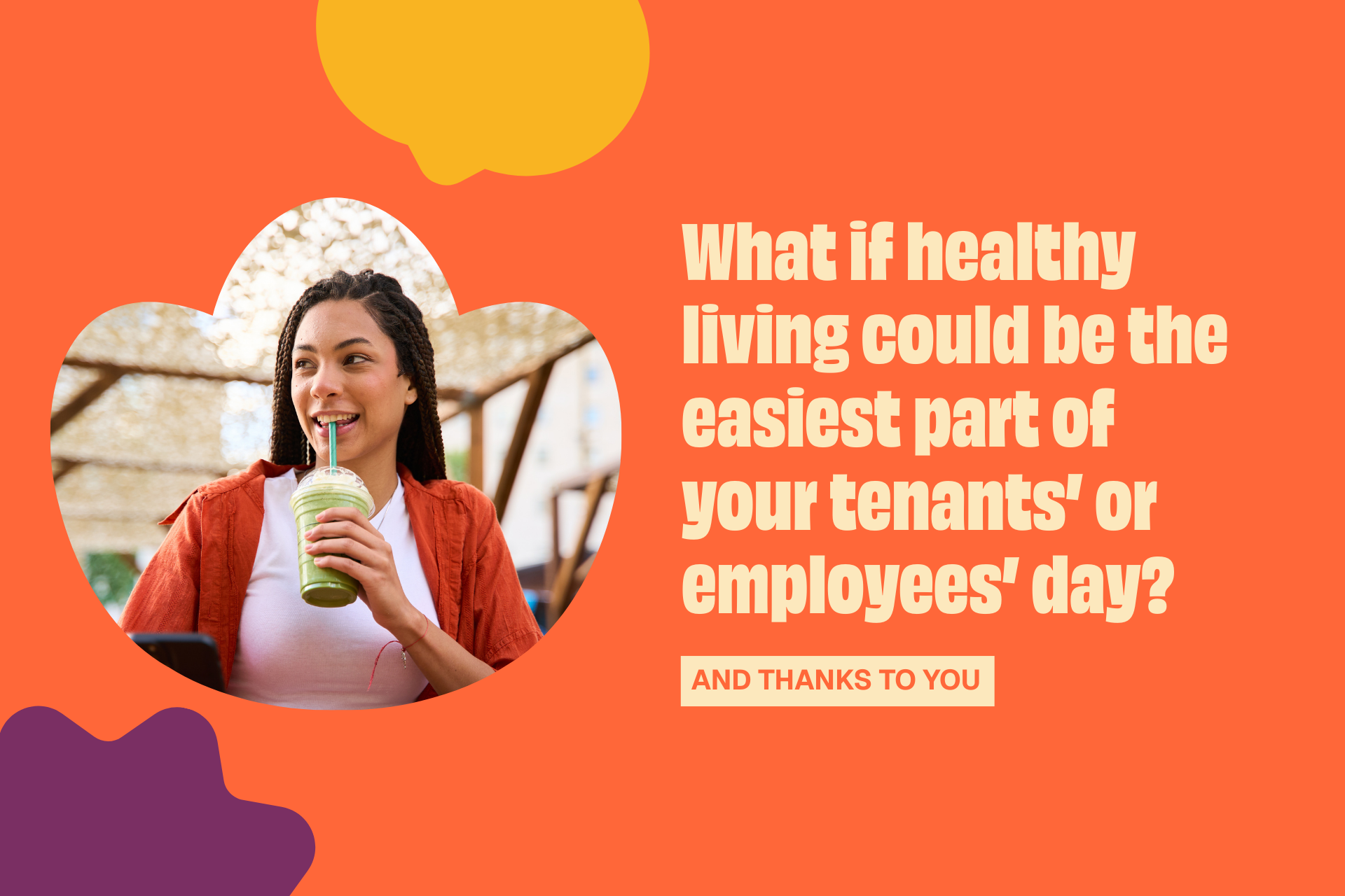
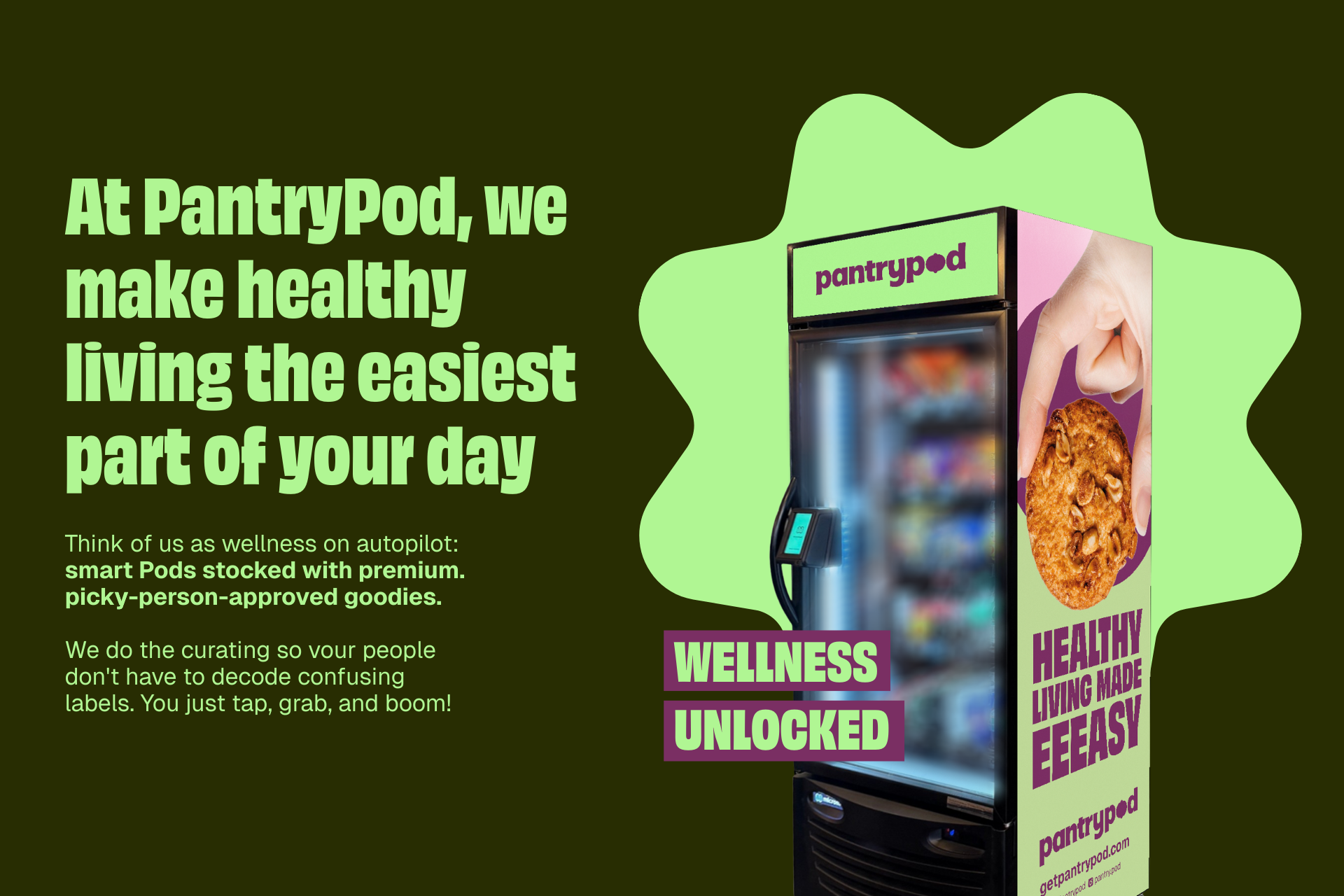
PantryPod's voice is, above all, fun and full of humor. It’s energetic, practical, and welcoming, perfectly reflecting the brand's personality.
The brand’s language uses simple, straightforward communication that builds instant trust, closeness, and reliability. Playful expressions like “eeeasy” add rhythm to the copy and highlight its laid-back, friendly personality. It invites consumers to feel part of the P-Power community, one that understands the fast pace of daily life and celebrates small wins through smart choices.
-
PT
PT
Identidade Verbal
A voz da PantryPod é, acima de tudo, divertida e cheia de humor. É energética, prática e acolhedora, traduzindo a personalidade da marca.
A linguagem da marca inclui uma comunicação simples e direta, que estabelece uma relação imediata de confiança e proximidade. Expressões como "eeeasy" dão ritmo aos textos e reforçam a sua personalidade descontraída, acessível e amigável. Ela convida os consumidores a se sentirem parte da comunidade P-Power, que entende a correria do dia a dia e celebra as pequenas vitórias com escolhas inteligentes.
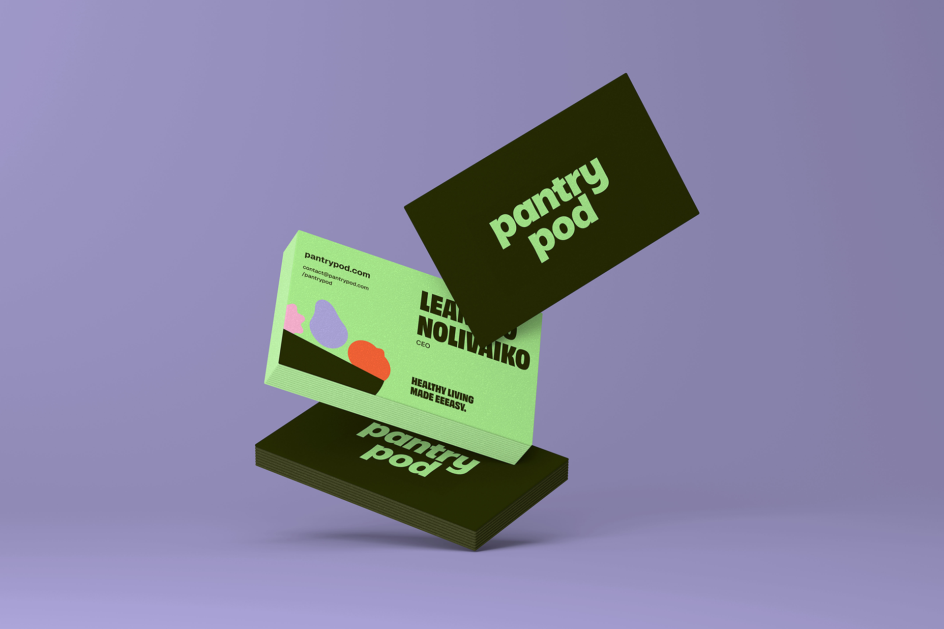
Visual Identity
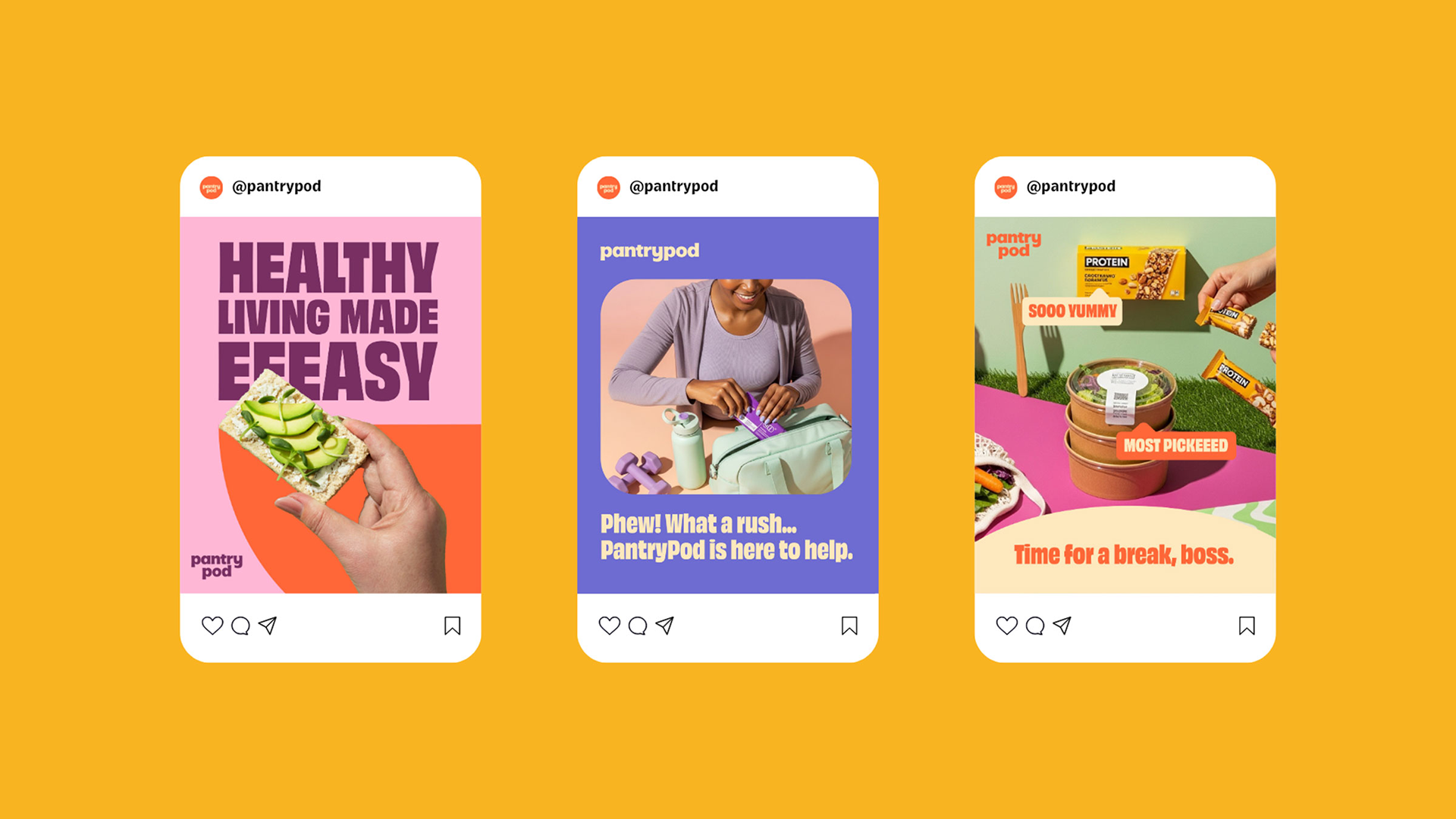
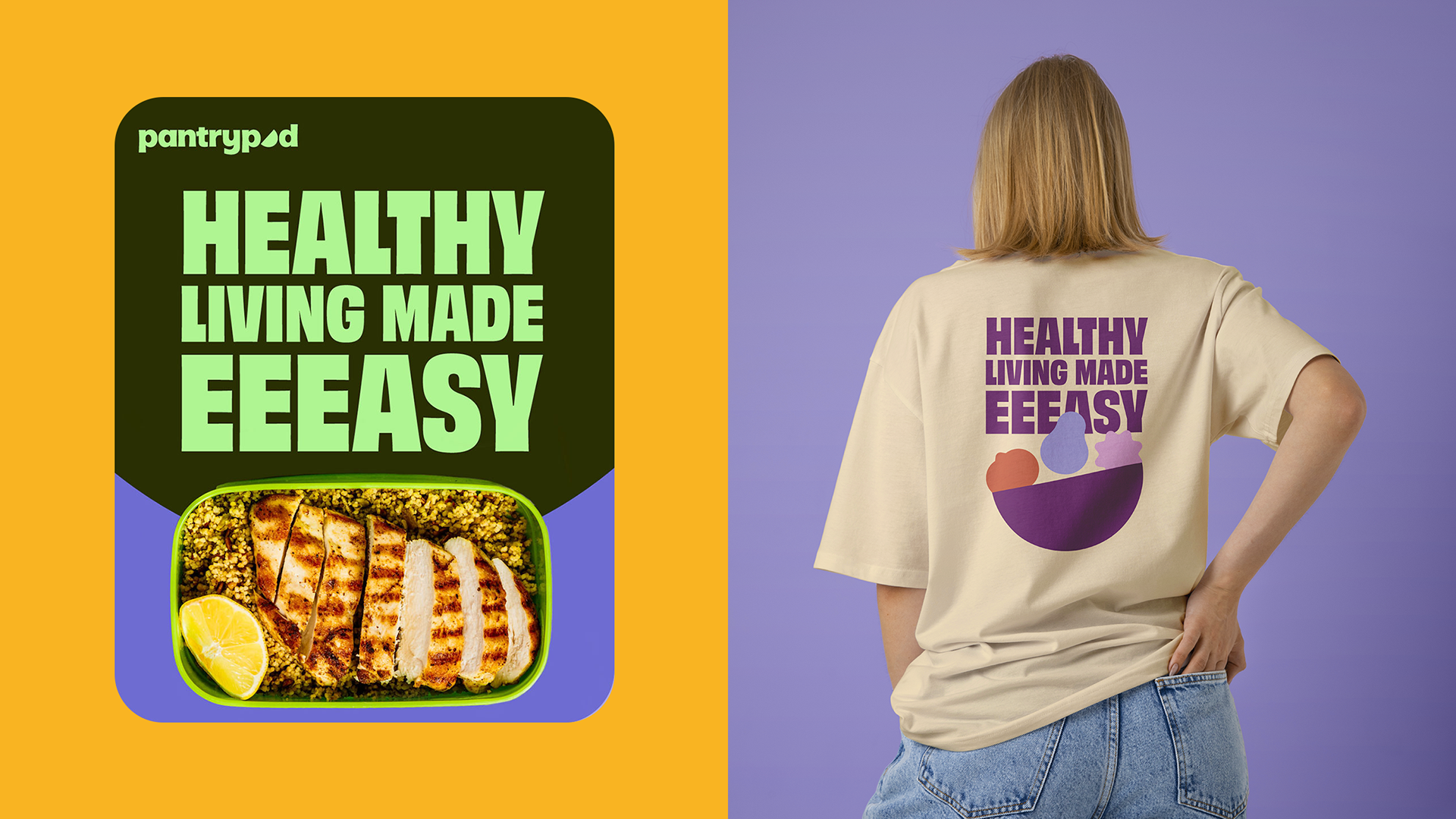
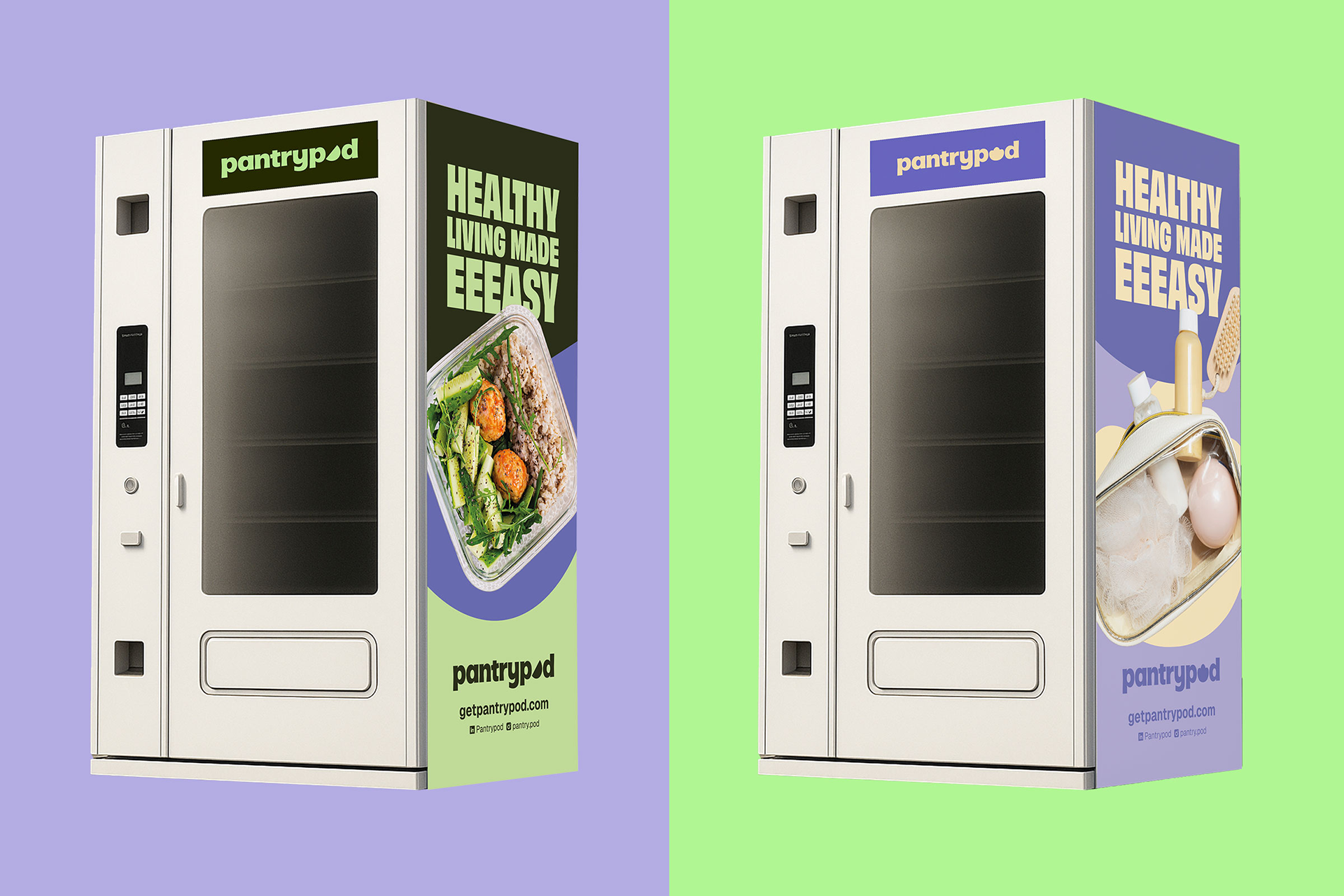
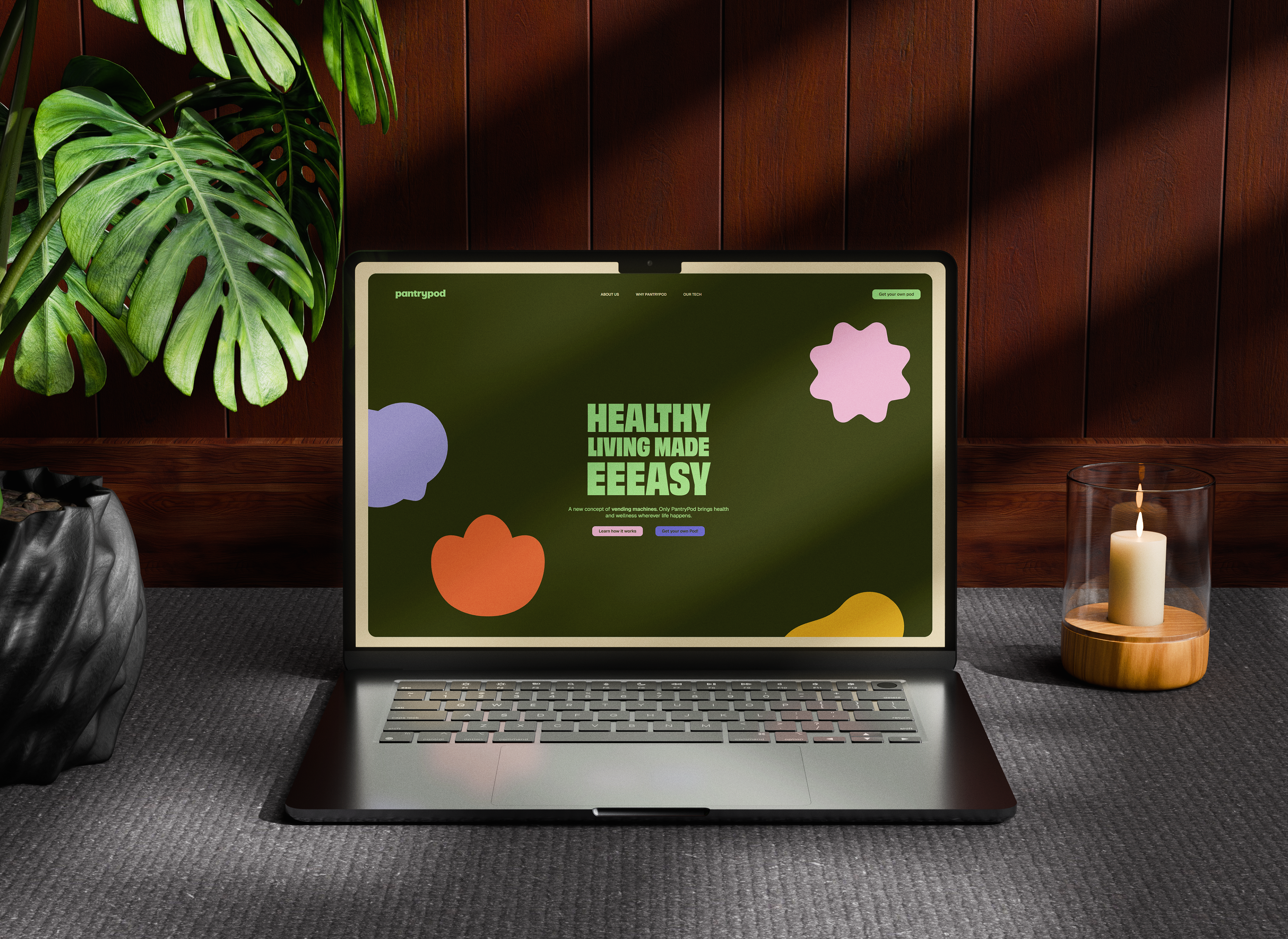
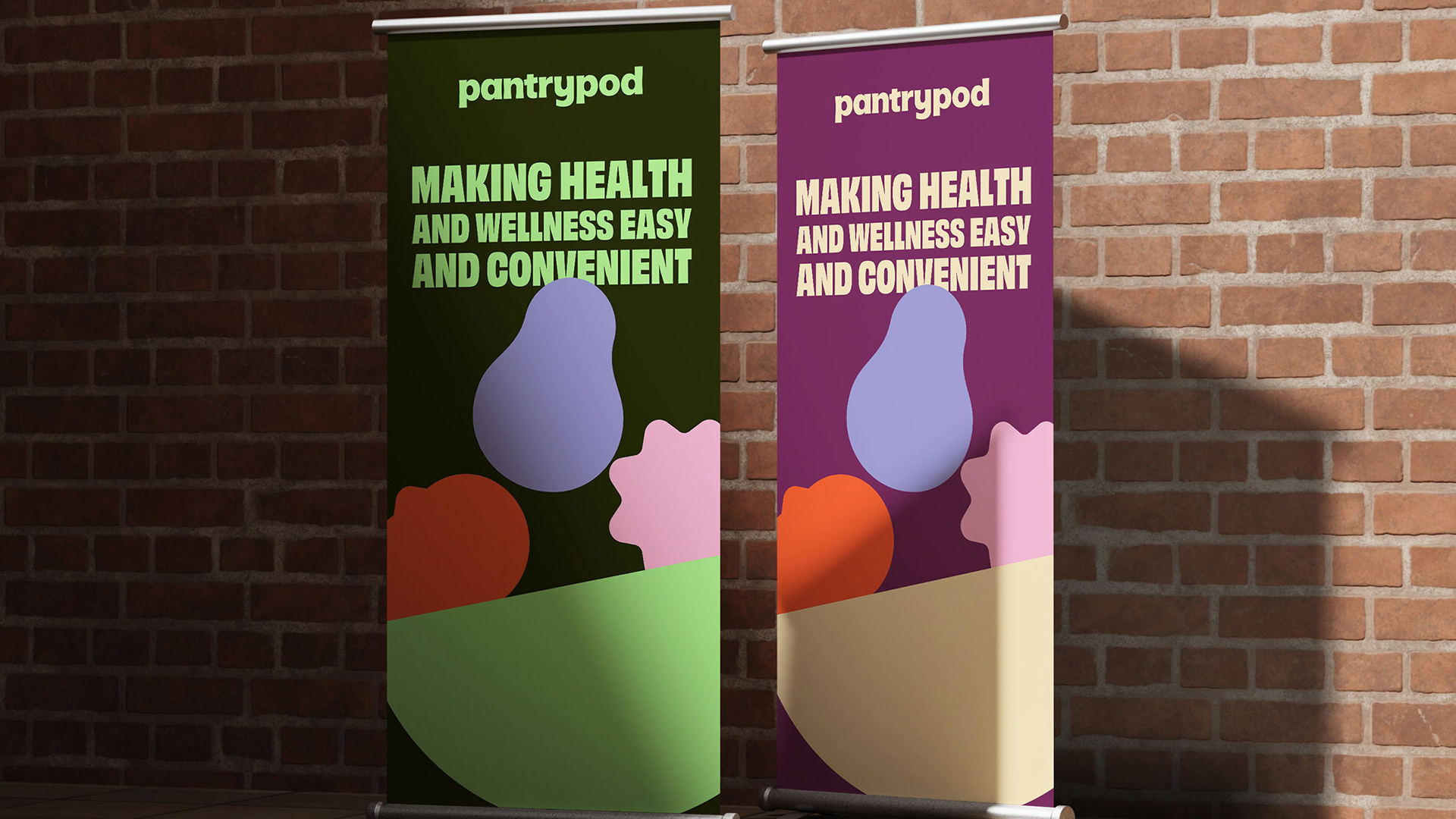
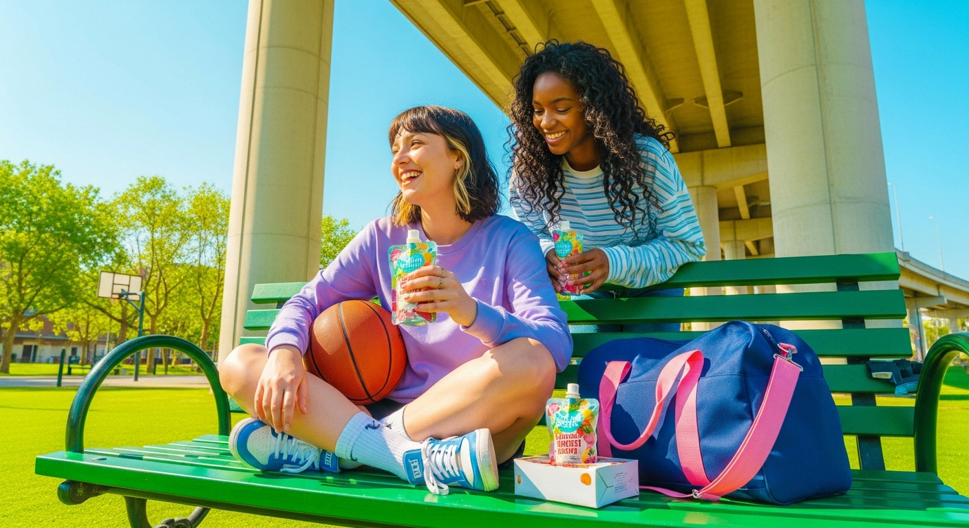
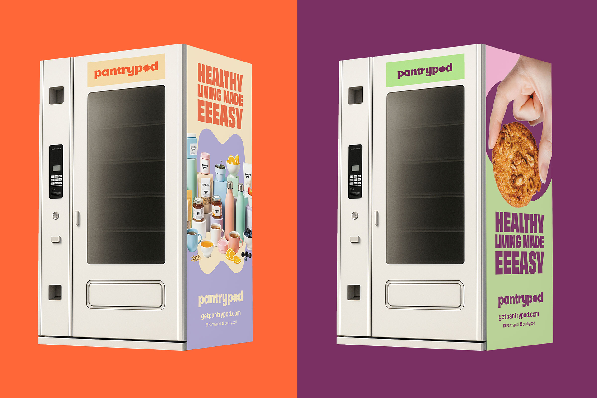
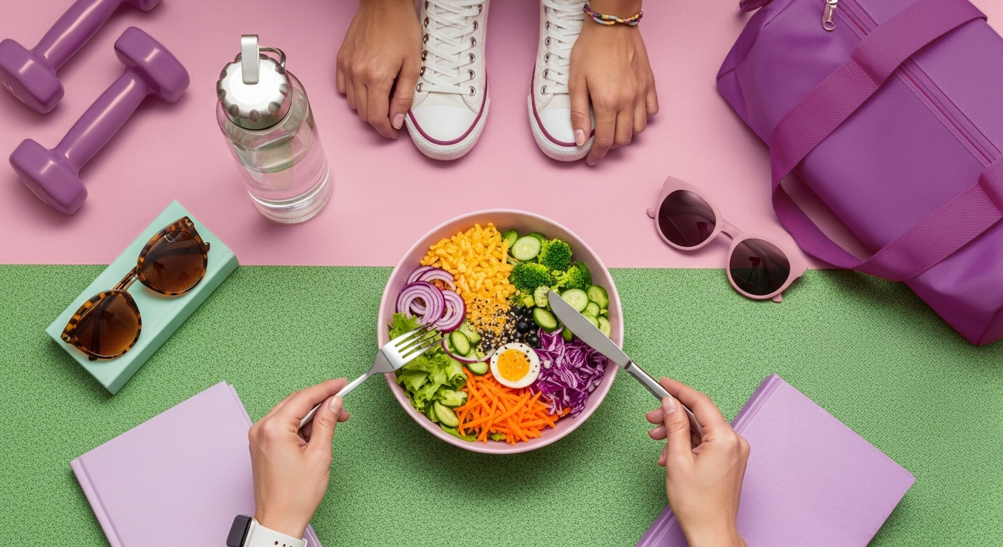
The visual identity brings energy and youthfulness to every touchpoint. Each color, graphic element, and typographic choice was designed to surprise, delight, and instantly evoke a healthier yet playful lifestyle. The photographic direction is also a standout feature of the project, with vibrant images capturing people in authentic, natural moments of urban life.
Another key aspect of the project was designing the icons that represent each PantryPod product category: Easy Peaks, Snacks to Go, Energy Boosters, Essentials & Self Care, and Eat Fresh. Each icon is paired with a distinct color combination to clearly signal, even from a distance, the type of products available in each vending machine.
-
PT
Identidade Visual
A identidade visual traz energia e jovialidade para cada ponto de contato. Cada cor, elemento gráfico e escolha tipográfica foi pensada para surpreender, encantar e evocar instantaneamente um estilo de vida mais saudável, mas ainda assim leve e divertido. A direção de fotografia também se tornou um dos destaques do projeto, com imagens vibrantes que retratam pessoas em momentos autênticos e naturais da vida urbana.
Outro ponto central do projeto foi o design dos ícones que representam cada categoria de produto da PantryPod: Easy Peaks, Snacks to Go, Energy Boosters, Essentials & Self Care e Eat Fresh. Cada ícone é combinado com uma paleta de cores distinta, facilitando a identificação, mesmo à distância, do tipo de produto disponível em cada máquina.
Brand positioning, visual identity and brand voice: Motora
Creative Direction: Luize Araújo
Strategy and writing: Luize Araújo, Laís Fonseca, Isabele Souza
Art Direction: Luize Araújo, Laís Fonseca
Designers: Luize Araújo, Laís Fonseca, Maria Stéfanni Carvalho, Júlia Lago
Motion Design: Push Media
Case Design: Júlia Chaves