TODA UP | REBRAND | 2026
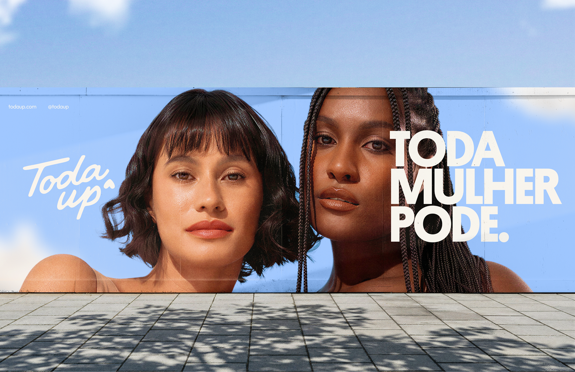
Toda mulher pode.
[PT]
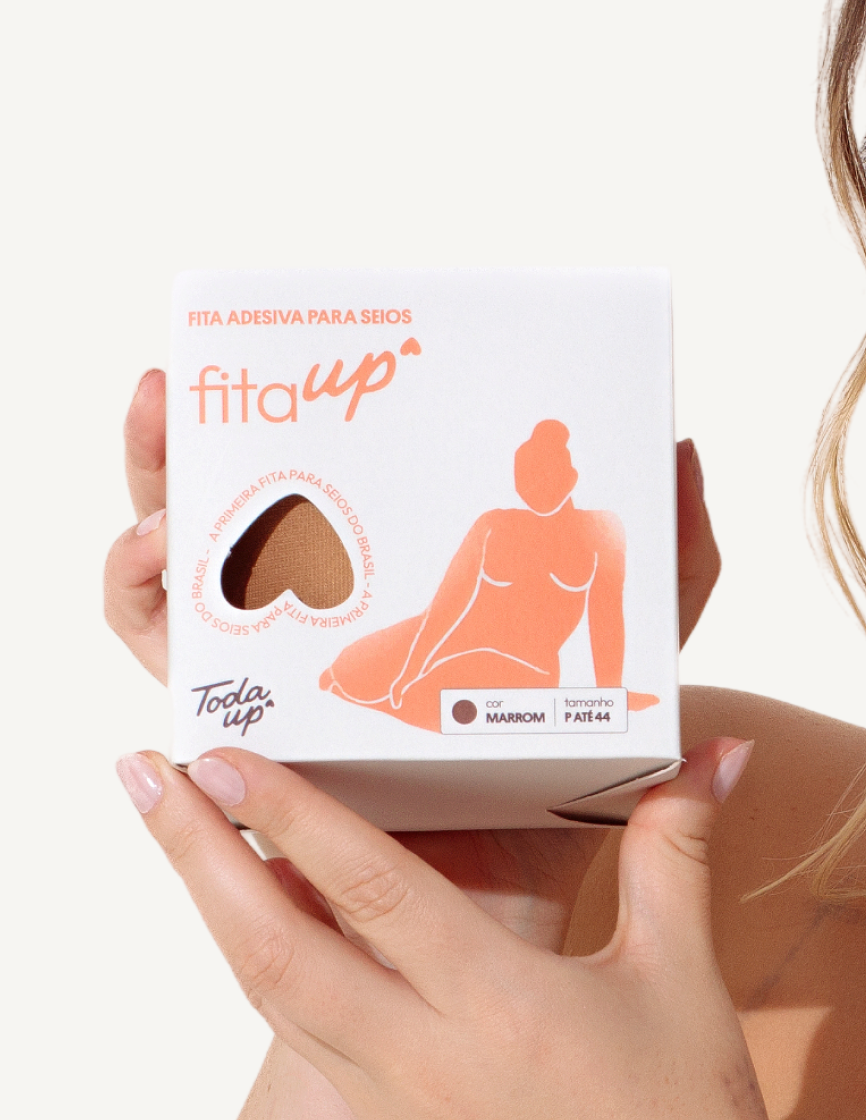
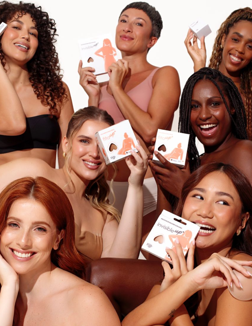
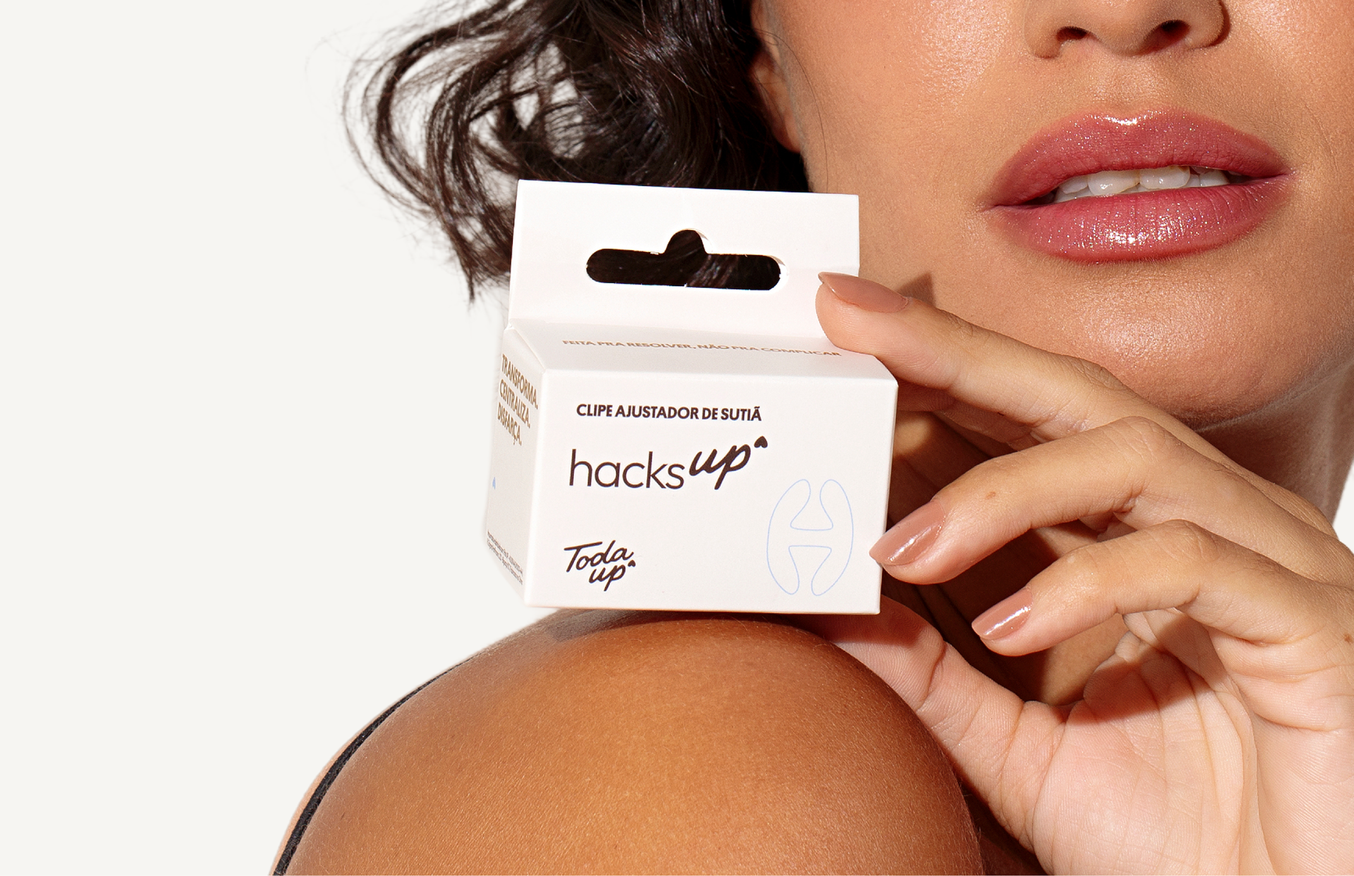
O projeto partia de uma base sólida. A FitaUp entrou no mercado há 5 anos com uma solução específica, uma fita para seios, e ganhou tração ao expandir seu portfólio com produtos relevantes para todas as mulheres. Deixou de ser uma solução pontual para se tornar um sistema pensado para diferentes corpos e momentos. O desafio era superar a percepção puramente funcional e construir uma conexão emocional, expandindo território e construindo significado de longo prazo.
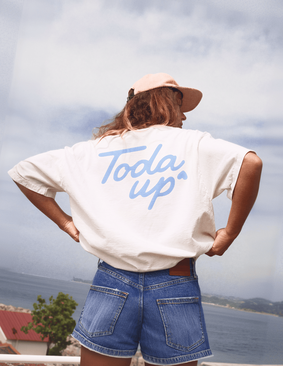
A evolução começou no nome: Toda Up. "Toda" traz pluralidade e pertencimento. "Up" mantém o legado de elevação e impulso. Esse direcionamento se traduz em um posicionamento que valoriza a força de marca já construída e a deixa pronta para o futuro.
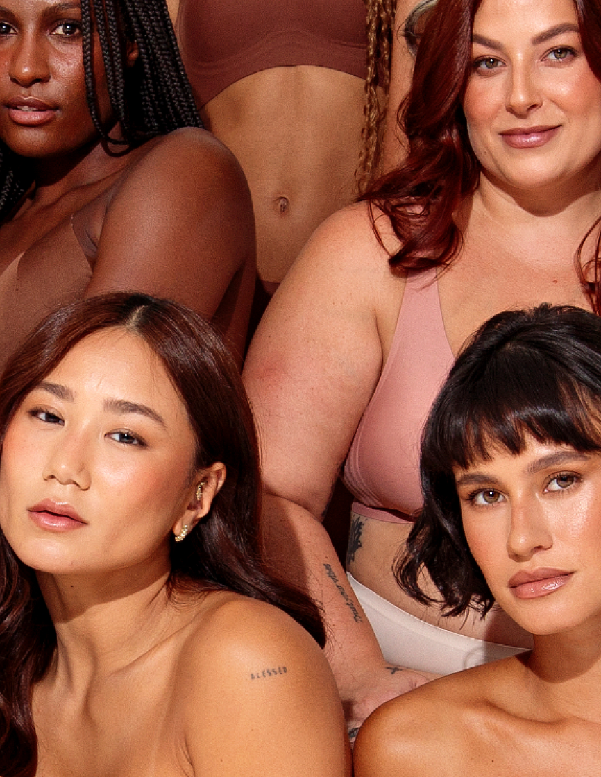
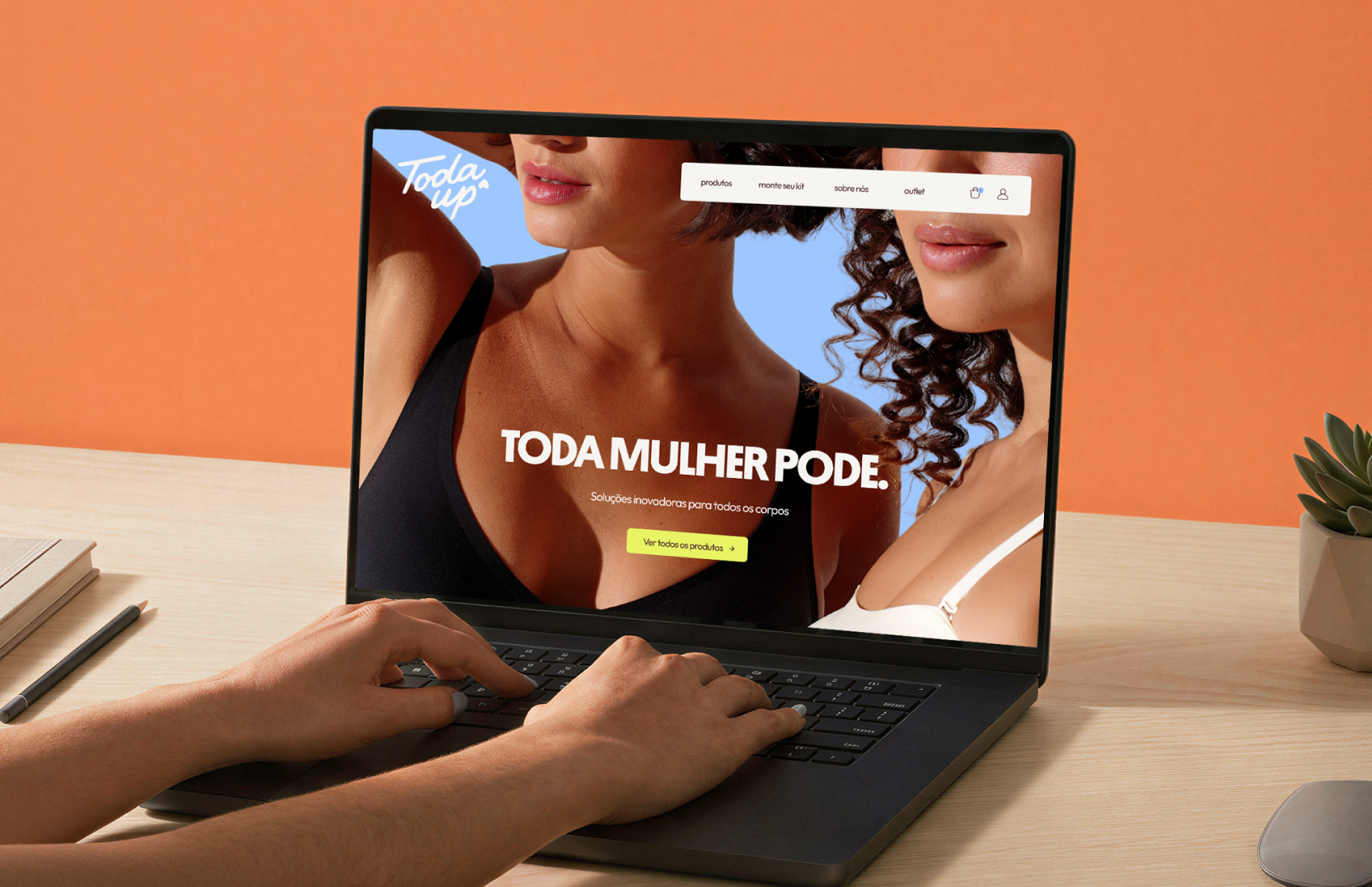
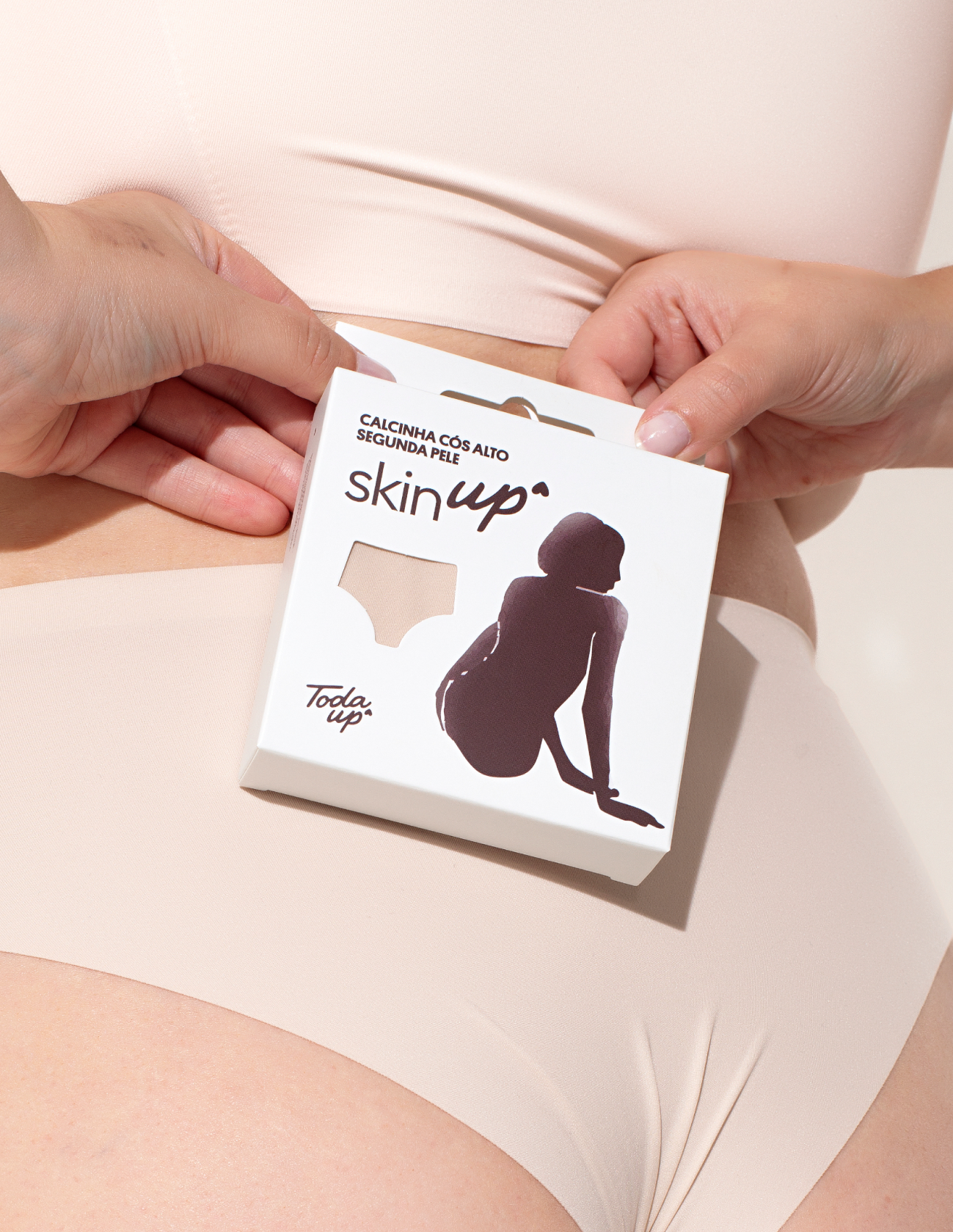
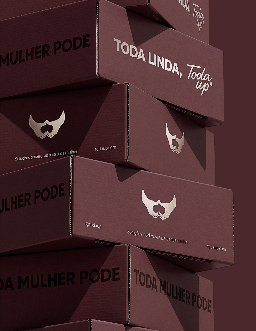
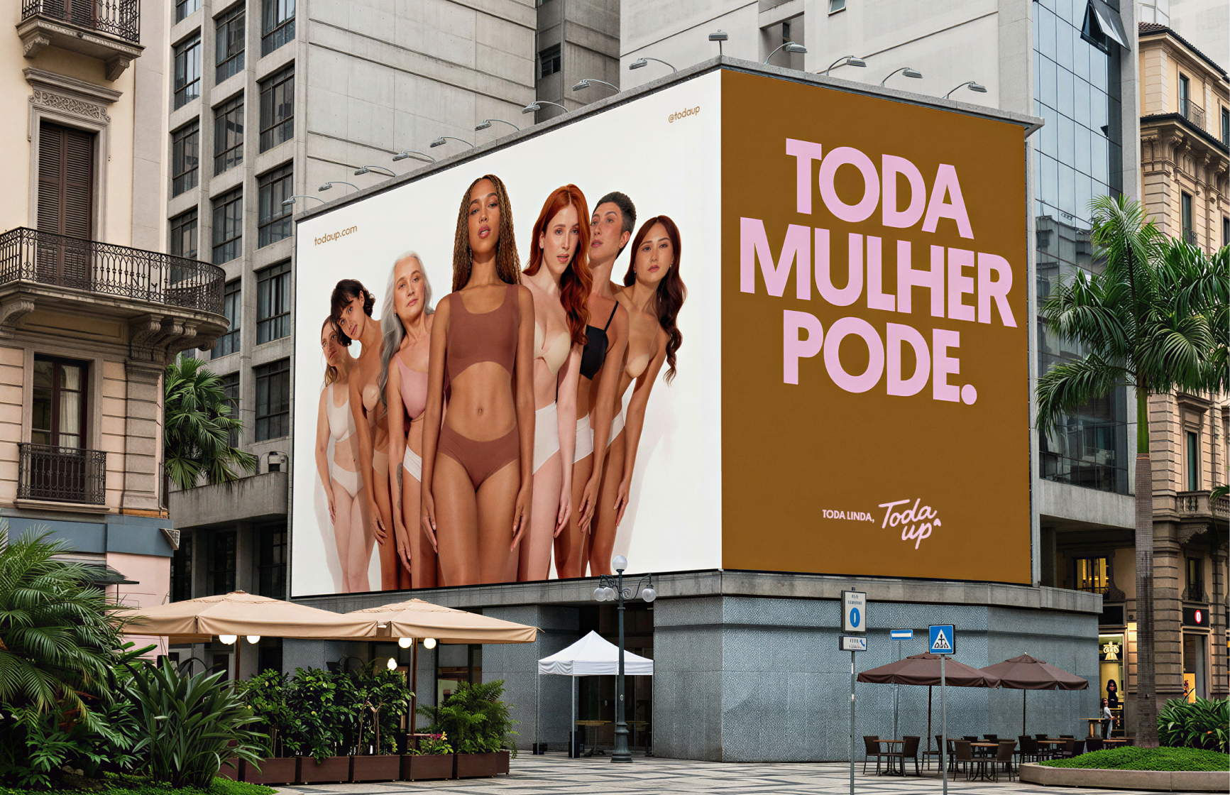
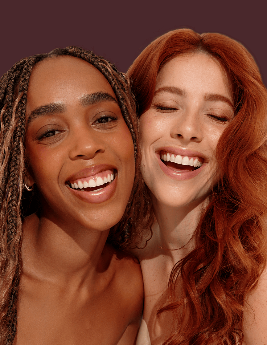
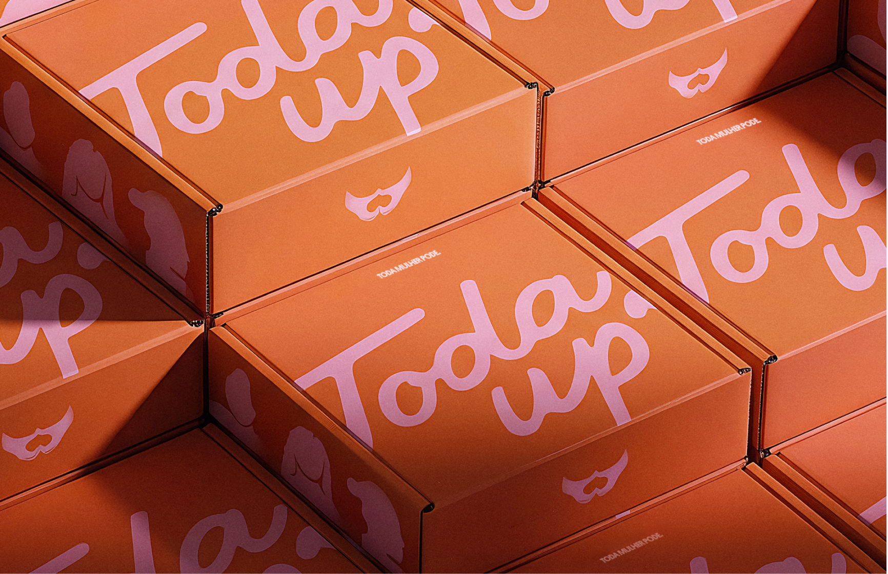
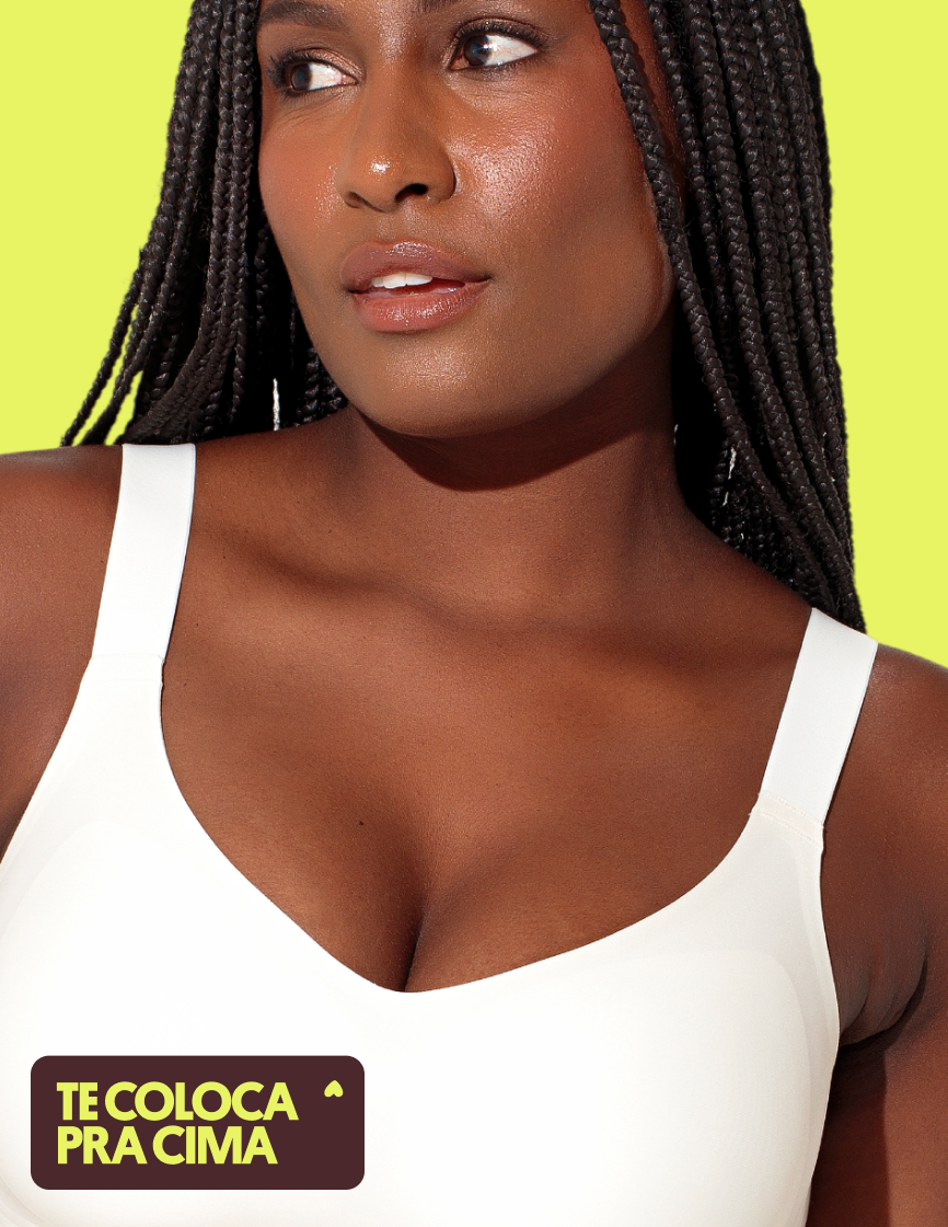
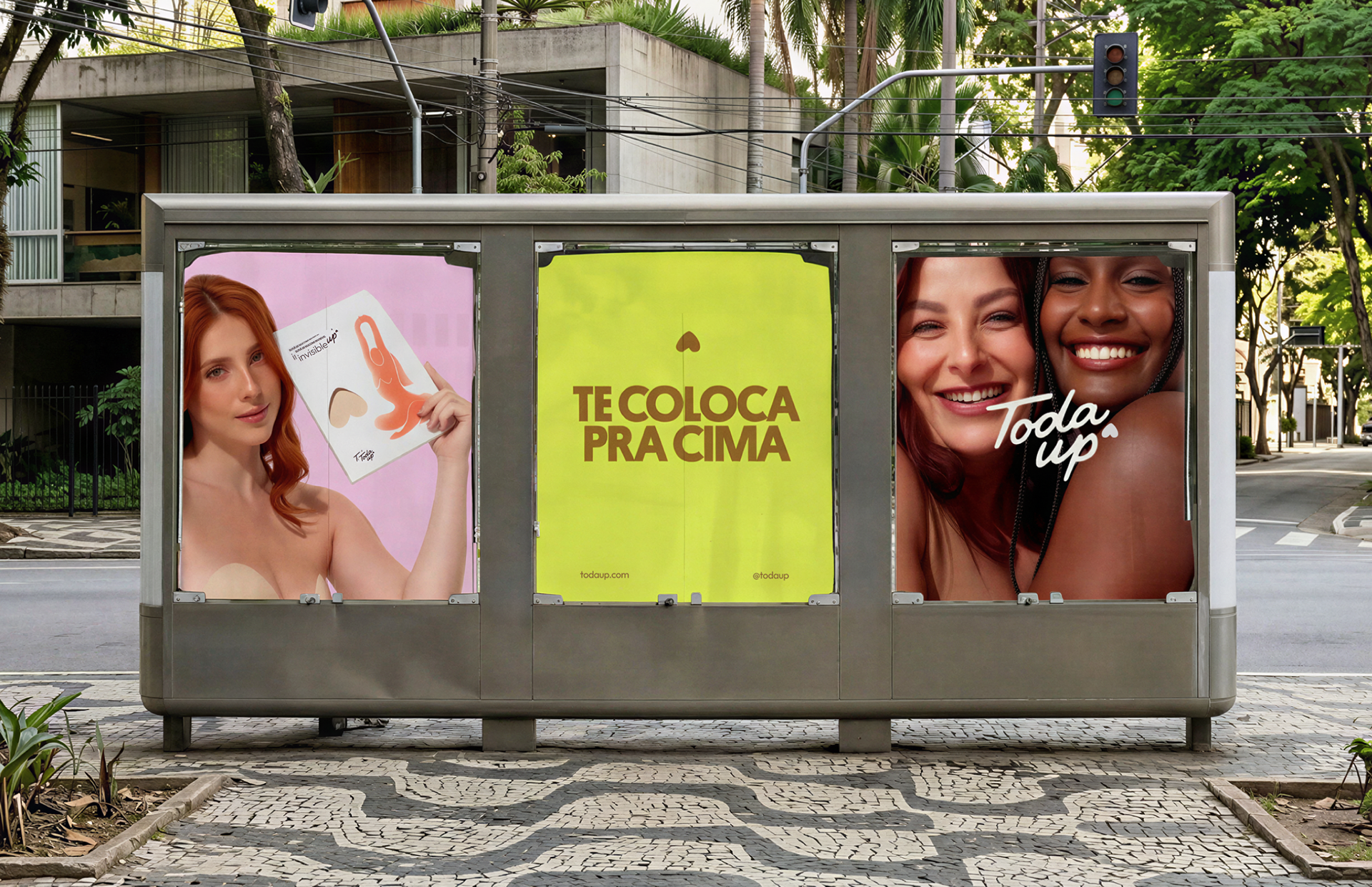
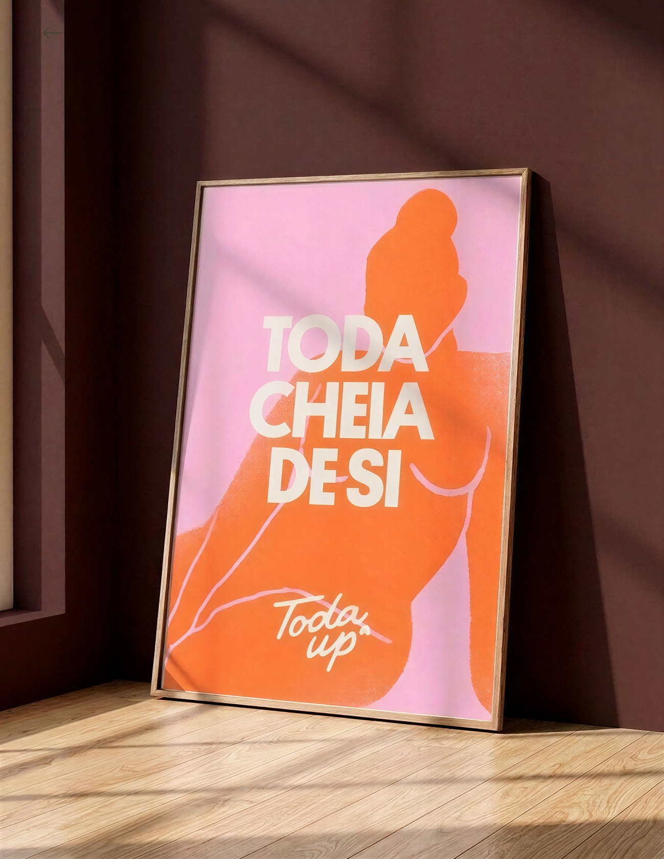
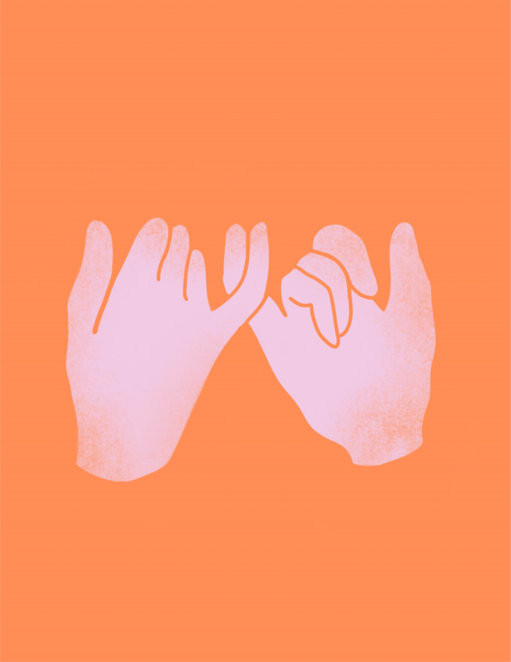
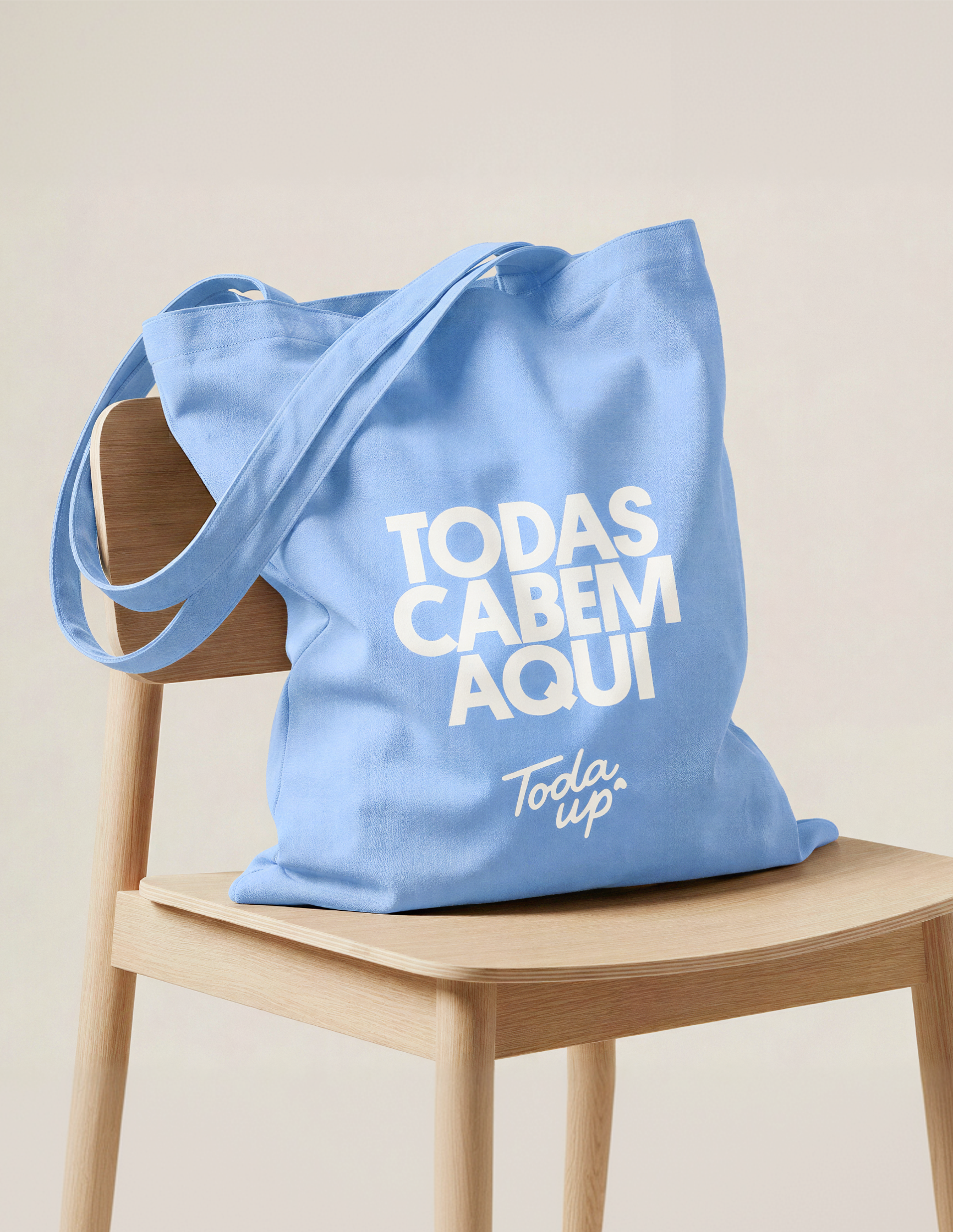
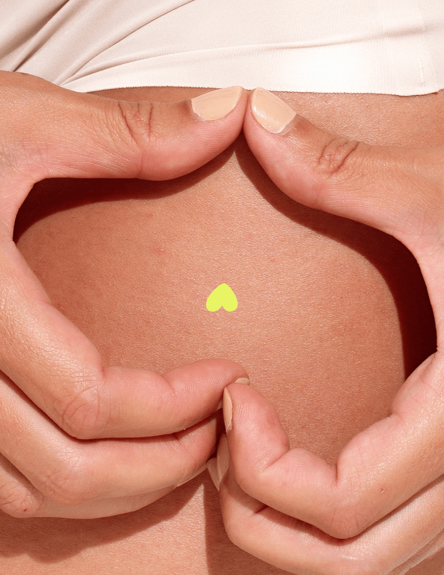
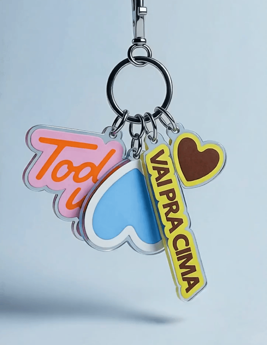
A Toda Up entrega liberdade de escolha. Remove fricções do cotidiano. Se torna um ecossistema de soluções que respeita a diversidade do corpo real. A identidade visual reforça esse posicionamento por meio de um sistema expressivo e versátil. A paleta amplia o território e representa pluralidade. A tipografia equilibra impacto e clareza. A direção imagética prioriza autenticidade, uso real e conexão entre mulheres.
Mais que uma nova identidade, um sistema de marca onde estratégia e expressão convergem. A Toda Up deixa de ser uma solução para se tornar um movimento: uma marca que não impõe padrões, mas amplia possibilidades. Ela se adapta, transforma o cotidiano em um espaço de escolha, confiança e liberdade. Para todas.
[EN] The project started from a solid foundation. FitaUp entered the market five years ago with a niche product, a breast tape, and gained traction by expanding into a portfolio designed for all women. It evolved from a single-use solution into a system built for different bodies and moments. The challenge was to move beyond a purely functional perception and build an emotional connection, expanding the brand’s territory and creating long-term meaning.
The evolution began with the name: Toda Up. "Toda" embodies plurality and belonging, while "Up" carries the legacy of elevation and momentum. This direction translates into a positioning that values the brand's already established strength and prepares it for the future.
Toda Up delivers freedom of choice. It removes the frictions of daily life, becoming an ecosystem of solutions that respects the diversity of real bodies. The visual identity reinforces this through an expressive and versatile system: a palette that celebrates diversity, typography that balances impact and clarity, and art direction that prioritizes authenticity and real connection between women.
More than a new identity, it is a brand system where strategy and expression converge. Toda Up moves beyond its solution to become a movement—a brand that doesn’t impose standards but expands possibilities. It adapts, transforming the everyday into a space of choice, confidence, and freedom. For every body.
A evolução começou no nome: Toda Up. "Toda" traz pluralidade e pertencimento. "Up" mantém o legado de elevação e impulso. Esse direcionamento se traduz em um posicionamento que valoriza a força de marca já construída e a deixa pronta para o futuro.
A Toda Up entrega liberdade de escolha. Remove fricções do cotidiano. Se torna um ecossistema de soluções que respeita a diversidade do corpo real. A identidade visual reforça esse posicionamento por meio de um sistema expressivo e versátil. A paleta amplia o território e representa pluralidade. A tipografia equilibra impacto e clareza. A direção imagética prioriza autenticidade, uso real e conexão entre mulheres.
Mais que uma nova identidade, um sistema de marca onde estratégia e expressão convergem. A Toda Up deixa de ser uma solução para se tornar um movimento: uma marca que não impõe padrões, mas amplia possibilidades. Ela se adapta, transforma o cotidiano em um espaço de escolha, confiança e liberdade. Para todas.
[EN] The project started from a solid foundation. FitaUp entered the market five years ago with a niche product, a breast tape, and gained traction by expanding into a portfolio designed for all women. It evolved from a single-use solution into a system built for different bodies and moments. The challenge was to move beyond a purely functional perception and build an emotional connection, expanding the brand’s territory and creating long-term meaning.
The evolution began with the name: Toda Up. "Toda" embodies plurality and belonging, while "Up" carries the legacy of elevation and momentum. This direction translates into a positioning that values the brand's already established strength and prepares it for the future.
Toda Up delivers freedom of choice. It removes the frictions of daily life, becoming an ecosystem of solutions that respects the diversity of real bodies. The visual identity reinforces this through an expressive and versatile system: a palette that celebrates diversity, typography that balances impact and clarity, and art direction that prioritizes authenticity and real connection between women.
More than a new identity, it is a brand system where strategy and expression converge. Toda Up moves beyond its solution to become a movement—a brand that doesn’t impose standards but expands possibilities. It adapts, transforming the everyday into a space of choice, confidence, and freedom. For every body.
_
Credits
Creative Direction and Execution: Bolívar Nunes, Paula Nunes, Marcella Fontes
Strategy and Tone of Voice: Bolívar Nunes, Paula Nunes, Marcella Fontes and Gabriela Balza
Photography & Video Capture: Adriano Casanova
Design Support: Gabriela Balza
Designer Support to Build the Case: Laís Fonseca
Photography & Video Capture: Adriano Casanova
Design Support: Gabriela Balza
Designer Support to Build the Case: Laís Fonseca